
- class sklearn.metrics.ConfusionMatrixDisplay(confusion_matrix, *, display_labels=None)[source]
-
Confusion Matrix visualization.
It is recommend to use
from_estimatoror
from_predictionsto
create aConfusionMatrixDisplay. All parameters are stored as
attributes.Read more in the User Guide.
- Parameters:
-
- confusion_matrixndarray of shape (n_classes, n_classes)
-
Confusion matrix.
- display_labelsndarray of shape (n_classes,), default=None
-
Display labels for plot. If None, display labels are set from 0 to
n_classes - 1.
- Attributes:
-
- im_matplotlib AxesImage
-
Image representing the confusion matrix.
- text_ndarray of shape (n_classes, n_classes), dtype=matplotlib Text, or None
-
Array of matplotlib axes.
Noneifinclude_valuesis false. - ax_matplotlib Axes
-
Axes with confusion matrix.
- figure_matplotlib Figure
-
Figure containing the confusion matrix.
See also
confusion_matrix-
Compute Confusion Matrix to evaluate the accuracy of a classification.
ConfusionMatrixDisplay.from_estimator-
Plot the confusion matrix given an estimator, the data, and the label.
ConfusionMatrixDisplay.from_predictions-
Plot the confusion matrix given the true and predicted labels.
Examples
>>> import matplotlib.pyplot as plt
>>> from sklearn.datasets import make_classification
>>> from sklearn.metrics import confusion_matrix, ConfusionMatrixDisplay
>>> from sklearn.model_selection import train_test_split
>>> from sklearn.svm import SVC
>>> X, y = make_classification(random_state=0)
>>> X_train, X_test, y_train, y_test = train_test_split(X, y,
...                                                     random_state=0)
>>> clf = SVC(random_state=0)
>>> clf.fit(X_train, y_train)
SVC(random_state=0)
>>> predictions = clf.predict(X_test)
>>> cm = confusion_matrix(y_test, predictions, labels=clf.classes_)
>>> disp = ConfusionMatrixDisplay(confusion_matrix=cm,
...                               display_labels=clf.classes_)
>>> disp.plot()
<...>
>>> plt.show()

Methods
from_estimator(estimator, X, y, *[, labels, …])Plot Confusion Matrix given an estimator and some data.
from_predictions(y_true, y_pred, *[, …])Plot Confusion Matrix given true and predicted labels.
plot(*[, include_values, cmap, …])Plot visualization.
- classmethod from_estimator(estimator, X, y, *, labels=None, sample_weight=None, normalize=None, display_labels=None, include_values=True, xticks_rotation=‘horizontal’, values_format=None, cmap=‘viridis’, ax=None, colorbar=True, im_kw=None, text_kw=None)[source]
-
Plot Confusion Matrix given an estimator and some data.
Read more in the User Guide.
New in version 1.0.
- Parameters:
-
- estimatorestimator instance
-
Fitted classifier or a fitted
Pipeline
in which the last estimator is a classifier. - X{array-like, sparse matrix} of shape (n_samples, n_features)
-
Input values.
- yarray-like of shape (n_samples,)
-
Target values.
- labelsarray-like of shape (n_classes,), default=None
-
List of labels to index the confusion matrix. This may be used to
reorder or select a subset of labels. IfNoneis given, those
that appear at least once iny_trueory_predare used in
sorted order. - sample_weightarray-like of shape (n_samples,), default=None
-
Sample weights.
- normalize{‘true’, ‘pred’, ‘all’}, default=None
-
Either to normalize the counts display in the matrix:
-
if
'true', the confusion matrix is normalized over the true
conditions (e.g. rows); -
if
'pred', the confusion matrix is normalized over the
predicted conditions (e.g. columns); -
if
'all', the confusion matrix is normalized by the total
number of samples; -
if
None(default), the confusion matrix will not be normalized.
-
- display_labelsarray-like of shape (n_classes,), default=None
-
Target names used for plotting. By default,
labelswill be used
if it is defined, otherwise the unique labels ofy_trueand
y_predwill be used. - include_valuesbool, default=True
-
Includes values in confusion matrix.
- xticks_rotation{‘vertical’, ‘horizontal’} or float, default=’horizontal’
-
Rotation of xtick labels.
- values_formatstr, default=None
-
Format specification for values in confusion matrix. If
None, the
format specification is ‘d’ or ‘.2g’ whichever is shorter. - cmapstr or matplotlib Colormap, default=’viridis’
-
Colormap recognized by matplotlib.
- axmatplotlib Axes, default=None
-
Axes object to plot on. If
None, a new figure and axes is
created. - colorbarbool, default=True
-
Whether or not to add a colorbar to the plot.
- im_kwdict, default=None
-
Dict with keywords passed to
matplotlib.pyplot.imshowcall. - text_kwdict, default=None
-
Dict with keywords passed to
matplotlib.pyplot.textcall.New in version 1.2.
- Returns:
-
- display
ConfusionMatrixDisplay
- display
See also
ConfusionMatrixDisplay.from_predictions-
Plot the confusion matrix given the true and predicted labels.
Examples
>>> import matplotlib.pyplot as plt
>>> from sklearn.datasets import make_classification
>>> from sklearn.metrics import ConfusionMatrixDisplay
>>> from sklearn.model_selection import train_test_split
>>> from sklearn.svm import SVC
>>> X, y = make_classification(random_state=0)
>>> X_train, X_test, y_train, y_test = train_test_split(
...         X, y, random_state=0)
>>> clf = SVC(random_state=0)
>>> clf.fit(X_train, y_train)
SVC(random_state=0)
>>> ConfusionMatrixDisplay.from_estimator(
...     clf, X_test, y_test)
<...>
>>> plt.show()
- classmethod from_predictions(y_true, y_pred, *, labels=None, sample_weight=None, normalize=None, display_labels=None, include_values=True, xticks_rotation=‘horizontal’, values_format=None, cmap=‘viridis’, ax=None, colorbar=True, im_kw=None, text_kw=None)[source]
-
Plot Confusion Matrix given true and predicted labels.
Read more in the User Guide.
New in version 1.0.
- Parameters:
-
- y_truearray-like of shape (n_samples,)
-
True labels.
- y_predarray-like of shape (n_samples,)
-
The predicted labels given by the method
predictof an
classifier. - labelsarray-like of shape (n_classes,), default=None
-
List of labels to index the confusion matrix. This may be used to
reorder or select a subset of labels. IfNoneis given, those
that appear at least once iny_trueory_predare used in
sorted order. - sample_weightarray-like of shape (n_samples,), default=None
-
Sample weights.
- normalize{‘true’, ‘pred’, ‘all’}, default=None
-
Either to normalize the counts display in the matrix:
-
if
'true', the confusion matrix is normalized over the true
conditions (e.g. rows); -
if
'pred', the confusion matrix is normalized over the
predicted conditions (e.g. columns); -
if
'all', the confusion matrix is normalized by the total
number of samples; -
if
None(default), the confusion matrix will not be normalized.
-
- display_labelsarray-like of shape (n_classes,), default=None
-
Target names used for plotting. By default,
labelswill be used
if it is defined, otherwise the unique labels ofy_trueand
y_predwill be used. - include_valuesbool, default=True
-
Includes values in confusion matrix.
- xticks_rotation{‘vertical’, ‘horizontal’} or float, default=’horizontal’
-
Rotation of xtick labels.
- values_formatstr, default=None
-
Format specification for values in confusion matrix. If
None, the
format specification is ‘d’ or ‘.2g’ whichever is shorter. - cmapstr or matplotlib Colormap, default=’viridis’
-
Colormap recognized by matplotlib.
- axmatplotlib Axes, default=None
-
Axes object to plot on. If
None, a new figure and axes is
created. - colorbarbool, default=True
-
Whether or not to add a colorbar to the plot.
- im_kwdict, default=None
-
Dict with keywords passed to
matplotlib.pyplot.imshowcall. - text_kwdict, default=None
-
Dict with keywords passed to
matplotlib.pyplot.textcall.New in version 1.2.
- Returns:
-
- display
ConfusionMatrixDisplay
- display
See also
ConfusionMatrixDisplay.from_estimator-
Plot the confusion matrix given an estimator, the data, and the label.
Examples
>>> import matplotlib.pyplot as plt
>>> from sklearn.datasets import make_classification
>>> from sklearn.metrics import ConfusionMatrixDisplay
>>> from sklearn.model_selection import train_test_split
>>> from sklearn.svm import SVC
>>> X, y = make_classification(random_state=0)
>>> X_train, X_test, y_train, y_test = train_test_split(
...         X, y, random_state=0)
>>> clf = SVC(random_state=0)
>>> clf.fit(X_train, y_train)
SVC(random_state=0)
>>> y_pred = clf.predict(X_test)
>>> ConfusionMatrixDisplay.from_predictions(
...    y_test, y_pred)
<...>
>>> plt.show()
- plot(*, include_values=True, cmap=‘viridis’, xticks_rotation=‘horizontal’, values_format=None, ax=None, colorbar=True, im_kw=None, text_kw=None)[source]
-
Plot visualization.
- Parameters:
-
- include_valuesbool, default=True
-
Includes values in confusion matrix.
- cmapstr or matplotlib Colormap, default=’viridis’
-
Colormap recognized by matplotlib.
- xticks_rotation{‘vertical’, ‘horizontal’} or float, default=’horizontal’
-
Rotation of xtick labels.
- values_formatstr, default=None
-
Format specification for values in confusion matrix. If
None,
the format specification is ‘d’ or ‘.2g’ whichever is shorter. - axmatplotlib axes, default=None
-
Axes object to plot on. If
None, a new figure and axes is
created. - colorbarbool, default=True
-
Whether or not to add a colorbar to the plot.
- im_kwdict, default=None
-
Dict with keywords passed to
matplotlib.pyplot.imshowcall. - text_kwdict, default=None
-
Dict with keywords passed to
matplotlib.pyplot.textcall.New in version 1.2.
- Returns:
-
- display
ConfusionMatrixDisplay -
Returns a
ConfusionMatrixDisplayinstance
that contains all the information to plot the confusion matrix.
- display


Examples using sklearn.metrics.ConfusionMatrixDisplay
-
class sklearn.metrics.ConfusionMatrixDisplay(confusion_matrix, *, display_labels=None)[источник] -
Визуализация матрицы запутанности.
Рекомендуется использовать
plot_confusion_matrixдля созданияConfusionMatrixDisplay. Все параметры хранятся как атрибуты.Подробнее читайте в Руководстве пользователя .
- Parameters
-
-
confusion_matrixndarray of shape (n_classes, n_classes) -
Confusion matrix.
-
display_labelsndarray of shape (n_classes,), default=None -
Отобразите метки для графика. Если None, метки отображения устанавливаются от 0 до
n_classes - 1.
-
- Attributes
-
-
im_matplotlib AxesImage -
Изображение,представляющее матрицу путаницы.
-
text_ndarray of shape (n_classes, n_classes), dtype=matplotlib Text, or None -
Массив осей matplotlib.
Noneеслиinclude_valuesложно. -
ax_matplotlib Axes -
Оси с матрицей путаницы.
-
figure_matplotlib Figure -
Рисунок,содержащий матрицу путаницы.
-
Examples
>>> from sklearn.datasets import make_classification
>>> from sklearn.metrics import confusion_matrix, ConfusionMatrixDisplay
>>> from sklearn.model_selection import train_test_split
>>> from sklearn.svm import SVC
>>> X, y = make_classification(random_state=0)
>>> X_train, X_test, y_train, y_test = train_test_split(X, y,
...                                                     random_state=0)
>>> clf = SVC(random_state=0)
>>> clf.fit(X_train, y_train)
SVC(random_state=0)
>>> predictions = clf.predict(X_test)
>>> cm = confusion_matrix(y_test, predictions, labels=clf.classes_)
>>> disp = ConfusionMatrixDisplay(confusion_matrix=cm,
...                               display_labels=clf.classes_)
>>> disp.plot()
Methods
plot(*[, include_values, cmap, …])Plot visualization.
-
plot(*, include_values=True, cmap='viridis', xticks_rotation='horizontal', values_format=None, ax=None, colorbar=True)[источник] -
Plot visualization.
- Parameters
-
-
include_valuesbool, default=True -
Включает значения в матрицу путаницы.
-
cmapstr or matplotlib Colormap, default=’viridis’ -
Цветовая карта,распознаваемая matplotlib.
-
xticks_rotation{‘vertical’, ‘horizontal’} or float, default=’horizontal’ -
Вращение меток xtick.
-
values_formatstr, default=None -
Спецификация формата для значений в матрице путаницы. Если
None, спецификация формата — «d» или «.2g», в зависимости от того, что короче. -
axmatplotlib axes, default=None -
Объект Axes для построения графика. Если
None, создается новая фигура и оси. -
colorbarbool, default=True -
Добавлять или нет цветную полосу к графику.
-
- Returns
-
-
displayConfusionMatrixDisplay
-
Примеры использования sklearn.metrics.ConfusionMatrixDisplay
scikit-learn
1.1
-
sklearn.metrics.completeness_score
Метрика полноты маркировки кластера с заданной истинностью.
-
sklearn.metrics.confusion_matrix
Вычислите матрицу путаницы, чтобы оценить точность классификации.
-
sklearn.metrics.consensus_score
Подобие двух наборов бикластеров.
-
sklearn.metrics.coverage_error
Мера ошибки охвата.
Note
Click here
to download the full example code or to run this example in your browser via Binder
Example of confusion matrix usage to evaluate the quality
of the output of a classifier on the iris data set. The
diagonal elements represent the number of points for which
the predicted label is equal to the true label, while
off-diagonal elements are those that are mislabeled by the
classifier. The higher the diagonal values of the confusion
matrix the better, indicating many correct predictions.
The figures show the confusion matrix with and without
normalization by class support size (number of elements
in each class). This kind of normalization can be
interesting in case of class imbalance to have a more
visual interpretation of which class is being misclassified.
Here the results are not as good as they could be as our
choice for the regularization parameter C was not the best.
In real life applications this parameter is usually chosen
using Tuning the hyper-parameters of an estimator.
Confusion matrix, without normalization
[[13  0  0]
 [ 0 10  6]
 [ 0  0  9]]
Normalized confusion matrix
[[1.   0.   0.  ]
 [0.   0.62 0.38]
 [0.   0.   1.  ]]
import numpy as np
import matplotlib.pyplot as plt

from sklearn import svm, datasets
from sklearn.model_selection import train_test_split
from sklearn.metrics import ConfusionMatrixDisplay

# import some data to play with
iris = datasets.load_iris()
X = iris.data
y = iris.target
class_names = iris.target_names

# Split the data into a training set and a test set
X_train, X_test, y_train, y_test = train_test_split(X, y, random_state=0)

# Run classifier, using a model that is too regularized (C too low) to see
# the impact on the results
classifier = svm.SVC(kernel="linear", C=0.01).fit(X_train, y_train)

np.set_printoptions(precision=2)

# Plot non-normalized confusion matrix
titles_options = [
    ("Confusion matrix, without normalization", None),
    ("Normalized confusion matrix", "true"),
]
for title, normalize in titles_options:
    disp = ConfusionMatrixDisplay.from_estimator(
        classifier,
        X_test,
        y_test,
        display_labels=class_names,
        cmap=plt.cm.Blues,
        normalize=normalize,
    )
    disp.ax_.set_title(title)

    print(title)
    print(disp.confusion_matrix)

plt.show()
Total running time of the script: ( 0 minutes 0.183 seconds)
Gallery generated by Sphinx-Gallery
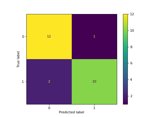
- Use Matplotlib to Plot Confusion Matrix in Python
- Use Seaborn to Plot Confusion Matrix in Python
- Use Pretty Confusion Matrix to Plot Confusion Matrix in Python

This article will discuss plotting a confusion matrix in Python using different library packages.
Use Matplotlib to Plot Confusion Matrix in Python
This program represents how we can plot the confusion matrix using Matplotlib.
Below are the two library packages we need to plot our confusion matrix.
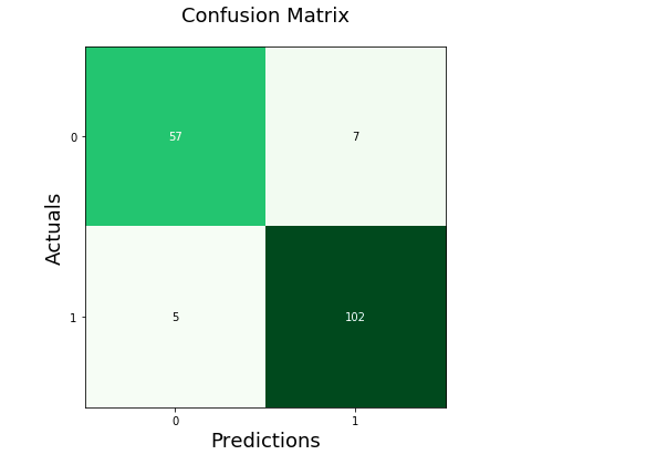
from sklearn.metrics import confusion_matrix
import matplotlib.pyplot as plt
After importing the necessary packages, we need to create the confusion matrix from the given data.
First, we declare the variables y_true and y_pred. y-true is filled with the actual values while y-pred is filled with the predicted values.
y_true = ["bat", "ball", "ball", "bat", "bat", "bat"]
y_pred = ["bat", "bat", "ball", "ball", "bat", "bat"]
We then declare a variable mat_con to store the matrix. Below is the syntax we will use to create the confusion matrix.
mat_con = (confusion_matrix(y_true, y_pred, labels=["bat", "ball"]))
It tells the program to create a confusion matrix with the two parameters, y_true and y_pred. labels tells the program that the confusion matrix will be made with two input values, bat and ball.
To plot a confusion matrix, we also need to indicate the attributes required to direct the program in creating a plot.
fig, px = plt.subplots(figsize=(7.5, 7.5))
px.matshow(mat_con, cmap=plt.cm.YlOrRd, alpha=0.5)
plt.subplots() creates an empty plot px in the system, while figsize=(7.5, 7.5) decides the x and y length of the output window. An equal x and y value will display your plot on a perfectly squared window.
px.matshow is used to fill our confusion matrix in the empty plot, whereas the cmap=plt.cm.YlOrRd directs the program to fill the columns with yellow-red gradients.
alpha=0.5 is used to decide the depth of gradient or how dark the yellow and red are.
Then, we run a nested loop to plot our confusion matrix in a 2X2 format.
for m in range(mat_con.shape[0]):
    for n in range(mat_con.shape[1]):
        px.text(x=m,y=n,s=mat_con[m, n], va='center', ha='center', size='xx-large')
for m in range(mat_con.shape[0]): runs the loop for the number of rows, (shape[0] stands for number of rows). for n in range(mat_con.shape[1]): runs another loop inside the existing loop for the number of columns present.
px.text(x=m,y=n,s=mat_con[m, n], va='center', ha='center', size='xx-large') fills the confusion matrix plot with the rows and columns values.
In the final step, we use plt.xlabel() and plt.ylabel() to label the axes, and we put the title plot with the syntax plt.title().
plt.xlabel('Predictions', fontsize=16)
plt.ylabel('Actuals', fontsize=16)
plt.title('Confusion Matrix', fontsize=15)
plt.show()
Putting it all together, we generate the complete code below.
# imports
from sklearn.metrics import confusion_matrix
import matplotlib.pyplot as plt

# creates confusion matrix
y_true = ["bat", "ball", "ball", "bat", "bat", "bat"]
y_pred = ["bat", "bat", "ball", "ball", "bat", "bat"]
mat_con = (confusion_matrix(y_true, y_pred, labels=["bat", "ball"]))

# Setting the attributes
fig, px = plt.subplots(figsize=(7.5, 7.5))
px.matshow(mat_con, cmap=plt.cm.YlOrRd, alpha=0.5)
for m in range(mat_con.shape[0]):
    for n in range(mat_con.shape[1]):
        px.text(x=m,y=n,s=mat_con[m, n], va='center', ha='center', size='xx-large')

# Sets the labels
plt.xlabel('Predictions', fontsize=16)
plt.ylabel('Actuals', fontsize=16)
plt.title('Confusion Matrix', fontsize=15)
plt.show()
Output:
Use Seaborn to Plot Confusion Matrix in Python
Using Seaborn allows us to create different-looking plots without dwelling much into attributes or the need to create nested loops.
Below is the library package needed to plot our confusion matrix.
As represented in the previous program, we would be creating a confusion matrix using the confusion_matrix() method.
To create the plot, we will be using the syntax below.
fx = sebrn.heatmap(conf_matrix, annot=True, cmap='turbo')
We used the seaborn heatmap plot. annot=True fills the plot with data; a False value would result in a plot with no values.
cmap='turbo' stands for the color shading; we can choose from tens of different shading for our plot.
The code below will label our axes and set the title.
fx.set_title('Plotting Confusion Matrix using Seabornnn');
fx.set_xlabel('nValues model predicted')
fx.set_ylabel('True Values ');
Lastly, we label the boxes with the following syntax. This step is optional, but not using it will decrease the visible logic clarity of the matrix.
fx.xaxis.set_ticklabels(['False','True'])
fx.yaxis.set_ticklabels(['False','True']
Let’s put everything together into a working program.
# imports
import seaborn as sebrn
from sklearn.metrics import confusion_matrix
import matplotlib.pyplot as atlas

y_true = ["bat", "ball", "ball", "bat", "bat", "bat"]
y_pred = ["bat", "bat", "ball", "ball", "bat", "bat"]
conf_matrix = (confusion_matrix(y_true, y_pred, labels=["bat", "ball"]))

# Using Seaborn heatmap to create the plot
fx = sebrn.heatmap(conf_matrix, annot=True, cmap='turbo')

# labels the title and x, y axis of plot
fx.set_title('Plotting Confusion Matrix using Seabornnn');
fx.set_xlabel('Predicted Values')
fx.set_ylabel('Actual Values ');

# labels the boxes
fx.xaxis.set_ticklabels(['False','True'])
fx.yaxis.set_ticklabels(['False','True'])

atlas.show()
Output:
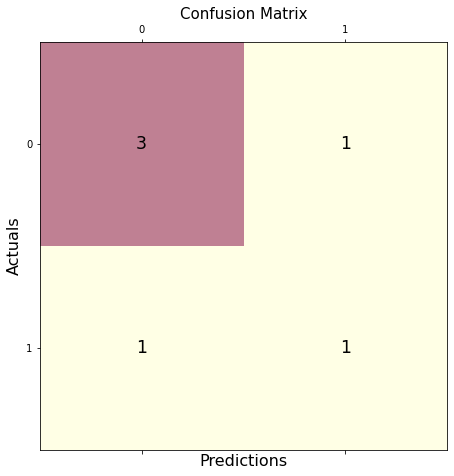
Use Pretty Confusion Matrix to Plot Confusion Matrix in Python
The Pretty Confusion Matrix is a Python library created to plot a stunning confusion matrix filled with lots of data related to metrics. This python library is useful when creating a highly detailed confusion matrix for your data sets.
In the below program, we plotted a confusion matrix using two sets of arrays: true_values and predicted_values. As we can see, plotting through Pretty Confusion Matrix is relatively simple than other plotting libraries.
from pretty_confusion_matrix import pp_matrix_from_data

true_values = [1,0,0,1,0,0,1,0,0,1]
predicted_values = [1,0,0,1,0,1,0,0,1,1]

cmap = 'PuRd'
pp_matrix_from_data(true_values, predicted_values)
Output:
Visualizations play an essential role in the exploratory data analysis activity of machine learning.
You can plot confusion matrix using the confusion_matrix() method from sklearn.metrics package.
Why Confusion Matrix?
After creating a machine learning model, accuracy is a metric used to evaluate the machine learning model. On the other hand, you cannot use accuracy in every case as it’ll be misleading. Because the accuracy of 99% may look good as a percentage, but consider a machine learning model used for Fraud Detection or Drug consumption detection.
In such critical scenarios, the 1% percentage failure can create a significant impact.
For example, if a model predicted a fraud transaction of 10000$ as Not Fraud, then it is not a good model and cannot be used in production.
In the drug consumption model, consider if the model predicted that the person had consumed the drug but actually has not. But due to the False prediction of the model, the person may be imprisoned for a crime that is not committed actually.
In such scenarios, you need a better metric than accuracy to validate the machine learning model.
This is where the confusion matrix comes into the picture.
In this tutorial, you’ll learn what a confusion matrix is, how to plot confusion matrix for the binary classification model and the multivariate classification model.
What is Confusion Matrix?
Confusion matrix is a matrix that allows you to visualize the performance of the classification machine learning models. With this visualization, you can get a better idea of how your machine learning model is performing.
Creating Binary Class Classification Model
In this section, you’ll create a classification model that will predict whether a patient has breast cancer or not, denoted by output classes True or False.
The breast cancer dataset is available in the sklearn dataset library.
It contains a total number of 569 data rows. Each row includes 30 numeric features and one output class. If you want to manipulate or visualize the sklearn dataset, you can convert it into pandas dataframe and play around with the pandas dataframe functionalities.
To create the model, you’ll load the sklearn dataset, split it into train and testing set and fit the train data into the KNeighborsClassifier model.
After creating the model, you can use the test data to predict the values and check how the model is performing.
You can use the actual output classes from your test data and the predicted output returned by the predict() method to plot the confusion matrix and evaluate the model accuracy.
Use the below snippet to create the model.
Snippet
import numpy as np

from sklearn.datasets import load_breast_cancer
from sklearn.model_selection import train_test_split
from sklearn.neighbors import KNeighborsClassifier as KNN

breastCancer = load_breast_cancer()

X = breastCancer.data
y = breastCancer.target

# Split the dataset into train and test
X_train, X_test, y_train, y_test = train_test_split(X, y, test_size = 0.4, random_state = 42)

knn = KNN(n_neighbors = 3)

# train the model
knn.fit(X_train, y_train)

print('Model is Created')
The KNeighborsClassifier model is created for the breast cancer training data.
Output
Model is CreatedTo test the model created, you can use the test data obtained from the train test split and predict the output. Then, you’ll have the predicted values.
Snippet
y_pred = knn.predict(X_test)

y_pred
Output
    array([0, 0, 0, 1, 1, 0, 0, 0, 1, 1, 1, 0, 1, 1, 1, 0, 0, 1, 1, 0, 0, 1,
           0, 1, 1, 1, 1, 1, 1, 0, 1, 1, 1, 0, 1, 1, 0, 1, 0, 1, 1, 0, 1, 1,
           1, 1, 1, 1, 1, 1, 0, 0, 1, 1, 1, 1, 1, 0, 1, 1, 1, 0, 0, 1, 1, 1,
           0, 0, 1, 1, 1, 0, 1, 1, 1, 1, 1, 1, 1, 1, 0, 1, 0, 0, 0, 0, 0, 0,
           1, 1, 1, 1, 1, 1, 1, 1, 0, 0, 1, 0, 0, 1, 0, 0, 0, 1, 1, 0, 1, 1,
           0, 1, 1, 0, 1, 0, 1, 1, 1, 0, 1, 1, 1, 0, 1, 0, 0, 1, 1, 0, 0, 0,
           0, 1, 1, 0, 1, 1, 0, 0, 1, 0, 1, 1, 1, 1, 0, 0, 0, 1, 0, 1, 1, 1,
           1, 0, 0, 1, 1, 1, 1, 1, 1, 1, 0, 1, 1, 1, 1, 0, 1, 1, 1, 1, 1, 1,
           0, 1, 1, 1, 1, 1, 1, 0, 0, 0, 0, 1, 0, 1, 0, 1, 1, 1, 1, 0, 1, 1,
           0, 1, 1, 1, 0, 1, 0, 0, 1, 1, 1, 1, 1, 1, 1, 1, 0, 1, 1, 1, 1, 1,
           0, 1, 0, 0, 1, 1, 0, 1])
Now use the predicted classes and the actual output classes from the test data to visualize the confusion matrix.
You’ll learn how to plot the confusion matrix for the binary classification model in the next section.
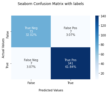
Plot Confusion Matrix for Binary Classes
You can create the confusion matrix using the confusion_matrix() method from sklearn.metrics package. The confusion_matrix() method will give you an array that depicts the True Positives, False Positives, False Negatives, and True negatives.
** Snippet**
from sklearn.metrics import confusion_matrix

#Generate the confusion matrix
cf_matrix = confusion_matrix(y_test, y_pred)

print(cf_matrix)
Output
    [[ 73   7]
     [  7 141]]
Once you have the confusion matrix created, you can use the heatmap() method available in the seaborn library to plot the confusion matrix.
Seaborn heatmap() method accepts one mandatory parameter and few other optional parameters.
data– A rectangular dataset that can be coerced into a 2d array. Here, you can pass the confusion matrix you already haveannot=True– To write the data value in the cell of the printed matrix. By default, this isFalse.cmap=Blues– This is to denote the matplotlib color map names. Here, we’ve created the plot using the blue color shades.
The heatmap() method returns the matplotlib axes that can be stored in a variable. Here, you’ll store in variable ax. Now, you can set title, x-axis and y-axis labels and tick labels for x-axis and y-axis.
- Title – Used to label the complete image. Use the set_title() method to set the title.
- Axes-labels – Used to name the
xaxis oryaxis. Use the set_xlabel() to set the x-axis label and set_ylabel() to set the y-axis label. - Tick labels – Used to denote the datapoints on the axes. You can pass the tick labels in an array, and it must be in ascending order. Because the confusion matrix contains the values in the ascending order format. Use the xaxis.set_ticklabels() to set the tick labels for x-axis and yaxis.set_ticklabels() to set the tick labels for y-axis.
Finally, use the plot.show() method to plot the confusion matrix.
Use the below snippet to create a confusion matrix, set title and labels for the axis, and set the tick labels, and plot it.
Snippet
import seaborn as sns

ax = sns.heatmap(cf_matrix, annot=True, cmap='Blues')

ax.set_title('Seaborn Confusion Matrix with labelsnn');
ax.set_xlabel('nPredicted Values')
ax.set_ylabel('Actual Values ');

## Ticket labels - List must be in alphabetical order
ax.xaxis.set_ticklabels(['False','True'])
ax.yaxis.set_ticklabels(['False','True'])

## Display the visualization of the Confusion Matrix.
plt.show()
Output

Alternatively, you can also plot the confusion matrix using the ConfusionMatrixDisplay.from_predictions() method available in the sklearn library itself if you want to avoid using the seaborn.
Next, you’ll learn how to plot a confusion matrix with percentages.
Plot Confusion Matrix for Binary Classes With Percentage
The objective of creating and plotting the confusion matrix is to check the accuracy of the machine learning model. It’ll be good to visualize the accuracy with percentages rather than using just the number. In this section, you’ll learn how to plot a confusion matrix for binary classes with percentages.
To plot the confusion matrix with percentages, first, you need to calculate the percentage of True Positives, False Positives, False Negatives, and True negatives. You can calculate the percentage of these values by dividing the value by the sum of all values.
Using the np.sum() method, you can sum all values in the confusion matrix.
Then pass the percentage of each value as data to the heatmap() method by using the statement cf_matrix/np.sum(cf_matrix).
Use the below snippet to plot the confusion matrix with percentages.
Snippet
ax = sns.heatmap(cf_matrix/np.sum(cf_matrix), annot=True,
            fmt='.2%', cmap='Blues')

ax.set_title('Seaborn Confusion Matrix with labelsnn');
ax.set_xlabel('nPredicted Values')
ax.set_ylabel('Actual Values ');

## Ticket labels - List must be in alphabetical order
ax.xaxis.set_ticklabels(['False','True'])
ax.yaxis.set_ticklabels(['False','True'])

## Display the visualization of the Confusion Matrix.
plt.show()
Output

Plot Confusion Matrix for Binary Classes With Labels
In this section, you’ll plot a confusion matrix for Binary classes with labels True Positives, False Positives, False Negatives, and True negatives.
You need to create a list of the labels and convert it into an array using the np.asarray() method with shape 2,2. Then, this array of labels must be passed to the attribute annot. This will plot the confusion matrix with the labels annotation.
Use the below snippet to plot the confusion matrix with labels.
Snippet
labels = ['True Neg','False Pos','False Neg','True Pos']

labels = np.asarray(labels).reshape(2,2)

ax = sns.heatmap(cf_matrix, annot=labels, fmt='', cmap='Blues')

ax.set_title('Seaborn Confusion Matrix with labelsnn');
ax.set_xlabel('nPredicted Values')
ax.set_ylabel('Actual Values ');

## Ticket labels - List must be in alphabetical order
ax.xaxis.set_ticklabels(['False','True'])
ax.yaxis.set_ticklabels(['False','True'])

## Display the visualization of the Confusion Matrix.
plt.show()
Output

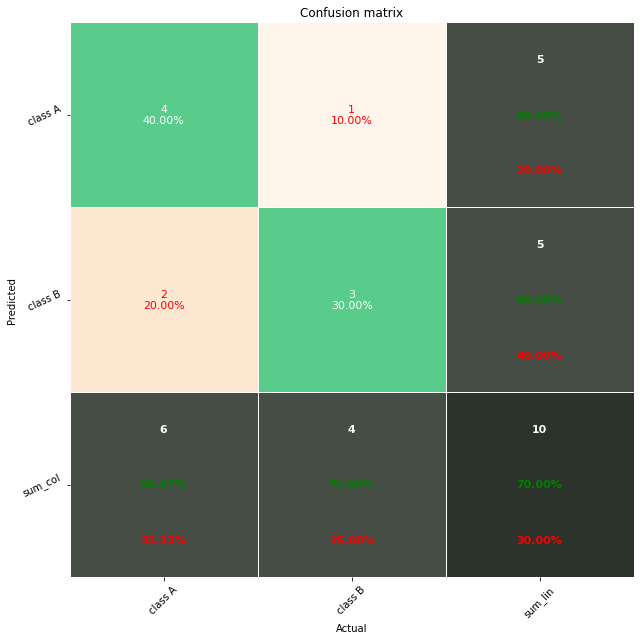
Plot Confusion Matrix for Binary Classes With Labels And Percentages
In this section, you’ll learn how to plot a confusion matrix with labels, counts, and percentages.
You can use this to measure the percentage of each label. For example, how much percentage of the predictions are True Positives, False Positives, False Negatives, and True negatives
For this, first, you need to create a list of labels, then count each label in one list and measure the percentage of the labels in another list.
Then you can zip these different lists to create labels. Zipping means concatenating an item from each list and create one list. Then, this list must be converted into an array using the np.asarray() method.
Then pass the final array to annot attribute. This will create a confusion matrix with the label, count, and percentage information for each class.
Use the below snippet to visualize the confusion matrix with all the details.
Snippet
group_names = ['True Neg','False Pos','False Neg','True Pos']

group_counts = ["{0:0.0f}".format(value) for value in
                cf_matrix.flatten()]

group_percentages = ["{0:.2%}".format(value) for value in
                     cf_matrix.flatten()/np.sum(cf_matrix)]

labels = [f"{v1}n{v2}n{v3}" for v1, v2, v3 in
          zip(group_names,group_counts,group_percentages)]

labels = np.asarray(labels).reshape(2,2)

ax = sns.heatmap(cf_matrix, annot=labels, fmt='', cmap='Blues')

ax.set_title('Seaborn Confusion Matrix with labelsnn');
ax.set_xlabel('nPredicted Values')
ax.set_ylabel('Actual Values ');

## Ticket labels - List must be in alphabetical order
ax.xaxis.set_ticklabels(['False','True'])
ax.yaxis.set_ticklabels(['False','True'])

## Display the visualization of the Confusion Matrix.
plt.show()
Output
This is how you can create a confusion matrix for the binary classification machine learning model.
Next, you’ll learn about creating a confusion matrix for a classification model with multiple output classes.
Creating Classification Model For Multiple Classes
In this section, you’ll create a classification model for multiple output classes. In other words, it’s also called multivariate classes.
You’ll be using the iris dataset available in the sklearn dataset library.
It contains a total number of 150 data rows. Each row includes four numeric features and one output class. Output class can be any of one Iris flower type. Namely, Iris Setosa, Iris Versicolour, Iris Virginica.
To create the model, you’ll load the sklearn dataset, split it into train and testing set and fit the train data into the KNeighborsClassifier model.
After creating the model, you can use the test data to predict the values and check how the model is performing.
You can use the actual output classes from your test data and the predicted output returned by the predict() method to plot the confusion matrix and evaluate the model accuracy.
Use the below snippet to create the model.
Snippet
import numpy as np
from sklearn.datasets import load_iris
from sklearn.model_selection import train_test_split
from sklearn.neighbors import KNeighborsClassifier as KNN
iris = load_iris()
X = iris.data
y = iris.target
# Split dataset into train and test
X_train, X_test, y_train, y_test = train_test_split(X, y, test_size = 0.4, random_state = 42)
knn = KNN(n_neighbors = 3)
# train th model
knn.fit(X_train, y_train)
print('Model is Created')
Output
Model is CreatedNow the model is created.
Use the test data from the train test split and predict the output value using the predict() method as shown below.
Snippet
y_pred = knn.predict(X_test)

y_pred
You’ll have the predicted output as an array. The value 0, 1, 2 shows the predicted category of the test data.
Output
    array([1, 0, 2, 1, 1, 0, 1, 2, 1, 1, 2, 0, 0, 0, 0, 1, 2, 1, 1, 2, 0, 2,
           0, 2, 2, 2, 2, 2, 0, 0, 0, 0, 1, 0, 0, 2, 1, 0, 0, 0, 2, 1, 1, 0,
           0, 1, 1, 2, 1, 2, 1, 2, 1, 0, 2, 1, 0, 0, 0, 1])
Now, you can use the predicted data available in y_pred to create a confusion matrix for multiple classes.
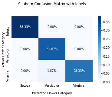
Plot Confusion matrix for Multiple Classes
In this section, you’ll learn how to plot a confusion matrix for multiple classes.
You can use the confusion_matrix() method available in the sklearn library to create a confusion matrix. It’ll contain three rows and columns representing the actual flower category and the predicted flower category in ascending order.
Snippet
from sklearn.metrics import confusion_matrix

#Get the confusion matrix
cf_matrix = confusion_matrix(y_test, y_pred)

print(cf_matrix)
Output
    [[23  0  0]
     [ 0 19  0]
     [ 0  1 17]]
The below output shows the confusion matrix for actual and predicted flower category counts.
You can use this matrix to plot the confusion matrix using the seaborn library, as shown below.
Snippet
import seaborn as sns
import matplotlib.pyplot as plt

ax = sns.heatmap(cf_matrix, annot=True, cmap='Blues')

ax.set_title('Seaborn Confusion Matrix with labelsnn');
ax.set_xlabel('nPredicted Flower Category')
ax.set_ylabel('Actual Flower Category ');

## Ticket labels - List must be in alphabetical order
ax.xaxis.set_ticklabels(['Setosa','Versicolor', 'Virginia'])
ax.yaxis.set_ticklabels(['Setosa','Versicolor', 'Virginia'])

## Display the visualization of the Confusion Matrix.
plt.show()
Output

Plot Confusion Matrix for Multiple Classes With Percentage
In this section, you’ll plot the confusion matrix for multiple classes with the percentage of each output class. You can calculate the percentage by dividing the values in the confusion matrix by the sum of all values.
Use the below snippet to plot the confusion matrix for multiple classes with percentages.
Snippet
ax = sns.heatmap(cf_matrix/np.sum(cf_matrix), annot=True,
            fmt='.2%', cmap='Blues')

ax.set_title('Seaborn Confusion Matrix with labelsnn');
ax.set_xlabel('nPredicted Flower Category')
ax.set_ylabel('Actual Flower Category ');

## Ticket labels - List must be in alphabetical order
ax.xaxis.set_ticklabels(['Setosa','Versicolor', 'Virginia'])
ax.yaxis.set_ticklabels(['Setosa','Versicolor', 'Virginia'])

## Display the visualization of the Confusion Matrix.
plt.show()
Output
Plot Confusion Matrix for Multiple Classes With Numbers And Percentages
In this section, you’ll learn how to plot a confusion matrix with labels, counts, and percentages for the multiple classes.
You can use this to measure the percentage of each label. For example, how much percentage of the predictions belong to each category of flowers.
For this, first, you need to create a list of labels, then count each label in one list and measure the percentage of the labels in another list.
Then you can zip these different lists to create concatenated labels. Zipping means concatenating an item from each list and create one list. Then, this list must be converted into an array using the np.asarray() method.
This final array must be passed to annot attribute. This will create a confusion matrix with the label, count, and percentage information for each category of flowers.
Use the below snippet to visualize the confusion matrix with all the details.
Snippet
#group_names = ['True Neg','False Pos','False Neg','True Pos','True Pos','True Pos','True Pos','True Pos','True Pos']

group_counts = ["{0:0.0f}".format(value) for value in
                cf_matrix.flatten()]

group_percentages = ["{0:.2%}".format(value) for value in
                     cf_matrix.flatten()/np.sum(cf_matrix)]

labels = [f"{v1}n{v2}n" for v1, v2 in
          zip(group_counts,group_percentages)]

labels = np.asarray(labels).reshape(3,3)

ax = sns.heatmap(cf_matrix, annot=labels, fmt='', cmap='Blues')

ax.set_title('Seaborn Confusion Matrix with labelsnn');
ax.set_xlabel('nPredicted Flower Category')
ax.set_ylabel('Actual Flower Category ');

## Ticket labels - List must be in alphabetical order
ax.xaxis.set_ticklabels(['Setosa','Versicolor', 'Virginia'])
ax.yaxis.set_ticklabels(['Setosa','Versicolor', 'Virginia'])

## Display the visualization of the Confusion Matrix.
plt.show()
Output
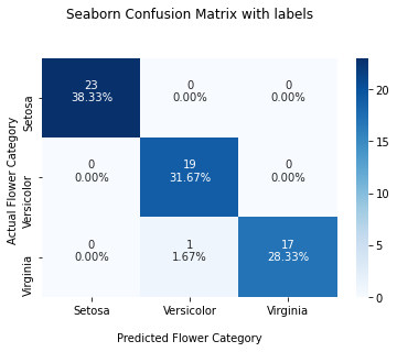
This is how you can plot a confusion matrix for multiple classes with percentages and numbers.
Plot Confusion Matrix Without Classifier
To plot the confusion matrix without a classifier model, refer to this StackOverflow answer.
Conclusion
To summarize, you’ve learned how to plot a confusion matrix for the machine learning model with binary output classes and multiple output classes.
You’ve also learned how to annotate the confusion matrix with more details such as labels, count of each label, and percentage of each label for better visualization.
If you’ve any questions, comment below.
You May Also Like
- How to Save and Load Machine Learning Models in python
- How to Plot Correlation Matrix in Python
In this short tutorial, you’ll see a full example of a Confusion Matrix in Python.
Topics to be reviewed:
- Creating a Confusion Matrix using pandas
- Displaying the Confusion Matrix using seaborn
- Getting additional stats via pandas_ml
- Working with non-numeric data
Creating a Confusion Matrix in Python using Pandas
To start, here is the dataset to be used for the Confusion Matrix in Python:
| y_actual | y_predicted |
| 1 | 1 |
| 0 | 1 |
| 0 | 0 |
| 1 | 1 |
| 0 | 0 |
| 1 | 1 |
| 0 | 1 |
| 0 | 0 |
| 1 | 1 |
| 0 | 0 |
| 1 | 0 |
| 0 | 0 |
You can then capture this data in Python by creating pandas DataFrame using this code:
import pandas as pd

data = {'y_actual':    [1, 0, 0, 1, 0, 1, 0, 0, 1, 0, 1, 0],
        'y_predicted': [1, 1, 0, 1, 0, 1, 1, 0, 1, 0, 0, 0]
        }

df = pd.DataFrame(data)
print(df)
This is how the data would look like once you run the code:
    y_actual  y_predicted
0          1            1
1          0            1
2          0            0
3          1            1
4          0            0
5          1            1
6          0            1
7          0            0
8          1            1
9          0            0
10         1            0
11         0            0
To create the Confusion Matrix using pandas, you’ll need to apply the pd.crosstab as follows:
confusion_matrix = pd.crosstab(df['y_actual'], df['y_predicted'], rownames=['Actual'], colnames=['Predicted'])
print (confusion_matrix)
And here is the full Python code to create the Confusion Matrix:
import pandas as pd

data = {'y_actual':    [1, 0, 0, 1, 0, 1, 0, 0, 1, 0, 1, 0],
        'y_predicted': [1, 1, 0, 1, 0, 1, 1, 0, 1, 0, 0, 0]
        }

df = pd.DataFrame(data)

confusion_matrix = pd.crosstab(df['y_actual'], df['y_predicted'], rownames=['Actual'], colnames=['Predicted'])
print(confusion_matrix)
Run the code and you’ll get the following matrix:
Predicted  0  1
Actual
0          5  2
1          1  4
Displaying the Confusion Matrix using seaborn
The matrix you just created in the previous section was rather basic.
You can use the seaborn package in Python to get a more vivid display of the matrix. To accomplish this task, you’ll need to add the following two components into the code:
- import seaborn as sn
- sn.heatmap(confusion_matrix, annot=True)
You’ll also need to use the matplotlib package to plot the results by adding:
- import matplotlib.pyplot as plt
- plt.show()
Putting everything together:
import pandas as pd
import seaborn as sn
import matplotlib.pyplot as plt

data = {'y_actual':    [1, 0, 0, 1, 0, 1, 0, 0, 1, 0, 1, 0],
        'y_predicted': [1, 1, 0, 1, 0, 1, 1, 0, 1, 0, 0, 0]
        }

df = pd.DataFrame(data)
confusion_matrix = pd.crosstab(df['y_actual'], df['y_predicted'], rownames=['Actual'], colnames=['Predicted'])

sn.heatmap(confusion_matrix, annot=True)
plt.show()
Optionally, you can also add the totals at the margins of the confusion matrix by setting margins=True.
So your Python code would look like this:
import pandas as pd
import seaborn as sn
import matplotlib.pyplot as plt

data = {'y_actual':    [1, 0, 0, 1, 0, 1, 0, 0, 1, 0, 1, 0],
        'y_predicted': [1, 1, 0, 1, 0, 1, 1, 0, 1, 0, 0, 0]
        }

df = pd.DataFrame(data)
confusion_matrix = pd.crosstab(df['y_actual'], df['y_predicted'], rownames=['Actual'], colnames=['Predicted'], margins=True)

sn.heatmap(confusion_matrix, annot=True)
plt.show()
Getting additional stats using pandas_ml
You may print additional stats (such as the Accuracy) using the pandas_ml package in Python. You can install the pandas_ml package using PIP:
pip install pandas_ml
You’ll then need to add the following syntax into the code:
confusion_matrix = ConfusionMatrix(df['y_actual'], df['y_predicted'])
confusion_matrix.print_stats()
Here is the complete code that you can use to get the additional stats:
import pandas as pd
from pandas_ml import ConfusionMatrix

data = {'y_actual':    [1, 0, 0, 1, 0, 1, 0, 0, 1, 0, 1, 0],
        'y_predicted': [1, 1, 0, 1, 0, 1, 1, 0, 1, 0, 0, 0]
        }

df = pd.DataFrame(data)
confusion_matrix = ConfusionMatrix(df['y_actual'], df['y_predicted'])
confusion_matrix.print_stats()
Run the code, and you’ll see the measurements below (note that if you’re getting an error when running the code, you may consider changing the version of pandas. For example, you may change the version of pandas to 0.23.4 using this command: pip install pandas==0.23.4):
population: 12
P: 5
N: 7
PositiveTest: 6
NegativeTest: 6
TP: 4
TN: 5
FP: 2
FN: 1
ACC: 0.75
For our example:
- TP = True Positives = 4
- TN = True Negatives = 5
- FP = False Positives = 2
- FN = False Negatives = 1
You can also observe the TP, TN, FP and FN directly from the Confusion Matrix:
For a population of 12, the Accuracy is:
Accuracy = (TP+TN)/population = (4+5)/12 = 0.75
Working with non-numeric data
So far you have seen how to create a Confusion Matrix using numeric data. But what if your data is non-numeric?
For example, what if your data contained non-numeric values, such as ‘Yes’ and ‘No’ (rather than ‘1’ and ‘0’)?
In this case:
- Yes = 1
- No = 0
So the dataset would look like this:
| y_actual | y_predicted |
| Yes | Yes |
| No | Yes |
| No | No |
| Yes | Yes |
| No | No |
| Yes | Yes |
| No | Yes |
| No | No |
| Yes | Yes |
| No | No |
| Yes | No |
| No | No |
You can then apply a simple mapping exercise to map ‘Yes’ to 1, and ‘No’ to 0.
Specifically, you’ll need to add the following portion to the code:
df['y_actual'] = df['y_actual'].map({'Yes': 1, 'No': 0})
df['y_predicted'] = df['y_predicted'].map({'Yes': 1, 'No': 0})
And this is how the complete Python code would look like:
import pandas as pd
from pandas_ml import ConfusionMatrix

data = {'y_actual':    ['Yes', 'No',  'No', 'Yes', 'No', 'Yes', 'No',  'No', 'Yes', 'No', 'Yes', 'No'],
        'y_predicted': ['Yes', 'Yes', 'No', 'Yes', 'No', 'Yes', 'Yes', 'No', 'Yes', 'No', 'No',  'No']
        }

df = pd.DataFrame(data)
df['y_actual'] = df['y_actual'].map({'Yes': 1, 'No': 0})
df['y_predicted'] = df['y_predicted'].map({'Yes': 1, 'No': 0})

confusion_matrix = ConfusionMatrix(df['y_actual'], df['y_predicted'])
confusion_matrix.print_stats()
You would then get the same stats:
population: 12
P: 5
N: 7
PositiveTest: 6
NegativeTest: 6
TP: 4
TN: 5
FP: 2
FN: 1
ACC: 0.75
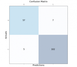
In this post, you will learn about how to draw / show confusion matrix using Matplotlib Python package. It is important to learn this technique as it will come very handy in assessing the machine learning model performance of classification models trained using different classification algorithms.
Confusion Matrix using Matplotlib
In order to demonstrate the confusion matrix using Matplotlib, let’s fit a pipeline estimator to the Sklearn breast cancer dataset using StandardScaler (for standardising the dataset) and Random Forest Classifier as the machine learning algorithm.
from sklearn import datasets
from sklearn.model_selection import train_test_split
from sklearn.preprocessing import StandardScaler
from sklearn.ensemble import RandomForestClassifier
from sklearn.pipeline import make_pipeline
#
# Load the breast cancer data set
#
bc = datasets.load_breast_cancer()
X = bc.data
y = bc.target
#
# Create training and test split
#
X_train, X_test, y_train, y_test = train_test_split(X, y, test_size=0.30, random_state=1, stratify=y)
#
# Create the pipeline
#
pipeline = make_pipeline(StandardScaler(),
RandomForestClassifier(n_estimators=10, max_features=5, max_depth=2, random_state=1))
#
# Fit the Pipeline estimator
#
pipeline.fit(X_train, y_train)
Once an estimator is fit to the training data set, nest step is to print the confusion matrix. In order to do that, the following steps will need to be followed:
- Get the predictions. Predict method on the instance of estimator (pipeline) is invoked.
- Create the confusion matrix using actuals and predictions for the test dataset. The confusion_matrix method of sklearn.metrics is used to create the confusion matrix array.
- Method matshow is used to print the confusion matrix box with different colors. In this example, the blue color is used. The method matshow is used to display an array as a matrix.
- In addition to the usage of matshow method, it is also required to loop through the array to print the prediction outcome in different boxes.
#
# Get the predictions
#
y_pred = pipeline.predict(X_test)
#
# Calculate the confusion matrix
#
conf_matrix = confusion_matrix(y_true=y_test, y_pred=y_pred)
#
# Print the confusion matrix using Matplotlib
#
fig, ax = plt.subplots(figsize=(7.5, 7.5))
ax.matshow(conf_matrix, cmap=plt.cm.Blues, alpha=0.3)
for i in range(conf_matrix.shape[0]):
    for j in range(conf_matrix.shape[1]):
        ax.text(x=j, y=i,s=conf_matrix[i, j], va='center', ha='center', size='xx-large')

plt.xlabel('Predictions', fontsize=18)
plt.ylabel('Actuals', fontsize=18)
plt.title('Confusion Matrix', fontsize=18)
plt.show()
This is how the confusion matrix will look like:
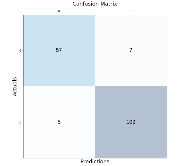
Confusion Matrix using Mlxtend Package
Here is another package, mlxtend.plotting (by Dr. Sebastian Rashcka) which can be used to draw or show confusion matrix. It is much simpler and easy to use than drawing the confusion matrix in the earlier section. All you need to do is import the method, plot_confusion_matrix and pass the confusion matrix array to the parameter, conf_mat. The green color is used to create the show the confusion matrix.
from mlxtend.plotting import plot_confusion_matrix

fig, ax = plot_confusion_matrix(conf_mat=conf_matrix, figsize=(6, 6), cmap=plt.cm.Greens)
plt.xlabel('Predictions', fontsize=18)
plt.ylabel('Actuals', fontsize=18)
plt.title('Confusion Matrix', fontsize=18)
plt.show()
Here is how the confusion matrix will look like:
- Author
- Recent Posts

I have been recently working in the area of Data analytics including Data Science and Machine Learning / Deep Learning. I am also passionate about different technologies including programming languages such as Java/JEE, Javascript, Python, R, Julia, etc, and technologies such as Blockchain, mobile computing, cloud-native technologies, application security, cloud computing platforms, big data, etc. For latest updates and blogs, follow us on Twitter. I would love to connect with you on Linkedin.
Check out my latest book titled as First Principles Thinking: Building winning products using first principles thinking

Ajitesh Kumar
I have been recently working in the area of Data analytics including Data Science and Machine Learning / Deep Learning. I am also passionate about different technologies including programming languages such as Java/JEE, Javascript, Python, R, Julia, etc, and technologies such as Blockchain, mobile computing, cloud-native technologies, application security, cloud computing platforms, big data, etc. For latest updates and blogs, follow us on Twitter. I would love to connect with you on Linkedin.
Check out my latest book titled as First Principles Thinking: Building winning products using first principles thinking
In this post I will demonstrate how to plot the Confusion Matrix. I will be using the confusion martrix from the Scikit-Learn library (sklearn.metrics) and Matplotlib for displaying the results in a more intuitive visual format.
The documentation for Confusion Matrix is pretty good, but I struggled to find a quick way to add labels and visualize the output into a 2×2 table.
For a good introductory read on confusion matrix check out this great post:
http://www.dataschool.io/simple-guide-to-confusion-matrix-terminology
This is a mockup of the look I am trying to achieve:
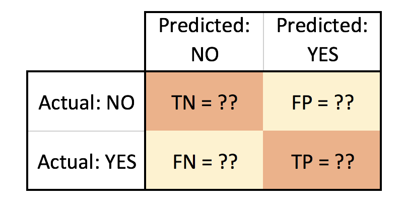
- TN = True Negative
- FN = False Negative
- FP = False Positive
- TP = True Positive
Let’s go through a quick Logistic Regression example using Scikit-Learn. For data I will use the popular Iris dataset (to read more about it reference https://en.wikipedia.org/wiki/Iris_flower_data_set).
We will use the confusion matrix to evaluate the accuracy of the classification and plot it using matplotlib:
import numpy as np
import pandas as pd
import matplotlib.pyplot as plt

from sklearn import datasets
data = datasets.load_iris()

df = pd.DataFrame(data.data, columns=data.feature_names)
df['Target'] = pd.DataFrame(data.target)
df.head()
>>> output
show first 5 rows | sepal length (cm) | sepal width (cm) | petal length (cm) | petal width (cm) | Target | |
|---|---|---|---|---|---|
| 5.1 | 3.5 | 1.4 | 0.2 | 0 | |
| 4.9 | 3.0 | 1.4 | 0.2 | 0 | |
| 4.7 | 3.2 | 1.3 | 0.2 | 0 | |
| 4.6 | 3.1 | 1.5 | 0.2 | 0 | |
| 5.0 | 3.6 | 1.4 | 0.2 | 0 |
We can examine our data quickly using Pandas correlation function to pick a suitable feature for our logistic regression. We will use the default pearson method.
corr = df.corr()
print(corr.Target)
>>> output
sepal length (cm) 0.782561
sepal width (cm) -0.419446
petal length (cm) 0.949043
petal width (cm) 0.956464
Target 1.000000
Name: Target, dtype: float64So, let’s pick the two with highest potential: Petal Width (cm) and Petal Lengthh (cm) as our (X) independent variables. For our Target/dependent variable (Y) we can pick the Versicolor class. The Target class actually has three choices, to simplify our task and narrow it down to a binary classifier I will pick Versicolor to narrow our classification classes to (0 or 1): either it is versicolor (1) or it is Not versicolor (0).
print(data.target_names) >>> output
array(['setosa', 'versicolor', 'virginica'],
dtype='<U10')Let’s now create our X and Y:
x = df.iloc[0: ,3].reshape(-1,1)
y = (data.target == 1).astype(np.int) # we are picking Versicolor to be 1 and all other classes will be 0
We will split our data into a test and train sets, then start building our Logistic Regression model. We will use an 80/20 split.
from sklearn.cross_validation import train_test_split

x_train, x_test, y_train, y_test = train_test_split(x,y, test_size = 0.20, random_state = 0)
Before we create our classifier, we will need to normalize the data (feature scaling) using the utility function StandardScalar part of Scikit-Learn preprocessing package.
from sklearn.preprocessing import StandardScaler
sc_x = StandardScaler()
x_train = sc_x.fit_transform(x_train)
x_test = sc_x.transform(x_test)
Now we are ready to build our Logistic Classifier:
from sklearn.linear_model import LogisticRegression
logit = LogisticRegression(random_state= 0)
logit.fit(x_train, y_train)

y_predicted = logit.predict(x_test)
Now, let’s evaluate our classifier with the confusion matrix:
from sklearn.metrics import confusion_matrix

cm = confusion_matrix(y_test, y_predicted)
print(cm)
>>> output
[[15 2]
[ 13 0]]Visually the above doesn’t easily convey how is our classifier performing, but we mainly focus on the top right and bottom left (these are the errors or misclassifications).
The confusion matrix tells us we a have total of 15 (13 + 2) misclassified data out of the 30 test points (in terms of: Versicolor, or Not Versicolor). A better way to visualize this can be accomplished with the code below:
plt.clf()
plt.imshow(cm, interpolation='nearest', cmap=plt.cm.Wistia)
classNames = ['Negative','Positive']
plt.title('Versicolor or Not Versicolor Confusion Matrix - Test Data')
plt.ylabel('True label')
plt.xlabel('Predicted label')
tick_marks = np.arange(len(classNames))
plt.xticks(tick_marks, classNames, rotation=45)
plt.yticks(tick_marks, classNames)
s = [['TN','FP'], ['FN', 'TP']]
for i in range(2):
    for j in range(2):
        plt.text(j,i, str(s[i][j])+" = "+str(cm[i][j]))
plt.show()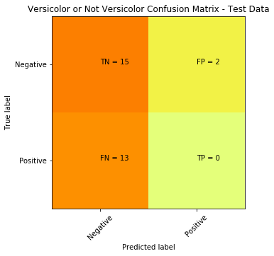
To plot and display the decision boundary that separates the two classes (Versicolor or Not Versicolor ):
from matplotlib.colors import ListedColormap
plt.clf()
X_set, y_set = x_test, y_test
X1, X2 = np.meshgrid(np.arange(start = X_set[:, 0].min() - 1, stop = X_set[:, 0].max() + 1, step = 0.01),
                     np.arange(start = X_set[:, 1].min() - 1, stop = X_set[:, 1].max() + 1, step = 0.01))
plt.contourf(X1, X2, logit.predict(np.array([X1.ravel(), X2.ravel()]).T).reshape(X1.shape),
             alpha = 0.75, cmap = ListedColormap(('red', 'green')))
plt.xlim(X1.min(), X1.max())
plt.ylim(X2.min(), X2.max())
for i, j in enumerate(np.unique(y_set)):
    plt.scatter(X_set[y_set == j, 0], X_set[y_set == j, 1],
                c = ListedColormap(('red', 'green'))(i), label = j)
plt.title('Logistic Regression (Test set)')
plt.xlabel('Petal Size')
plt.ylabel('Versicolor')
plt.legend()
plt.show()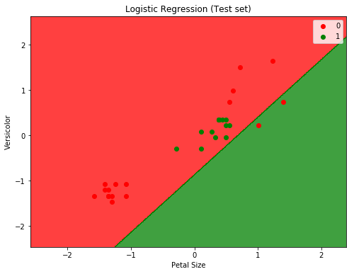
Will from the two plots we can easily see that the classifier is not doing a good job. And before digging into why (which will be another post on how to determine if data is linearly separable or not), we can assume that it’s because the data is not linearly separable (for the IRIS dataset in fact only setosa class is linearly separable).
We can try another non-linear classifier, in this case we can use SVM with a Gaussian RBF Kernel:
from sklearn.svm import SVC

svm = SVC(kernel='rbf', random_state=0)
svm.fit(x_train, y_train)

predicted = svm.predict(x_test)

cm = confusion_matrix(y_test, predicted)
plt.clf()
plt.imshow(cm, interpolation='nearest', cmap=plt.cm.Wistia)
classNames = ['Negative','Positive']
plt.title('SVM RBF Kernel Confusion Matrix - Test Data')
plt.ylabel('True label')
plt.xlabel('Predicted label')
tick_marks = np.arange(len(classNames))
plt.xticks(tick_marks, classNames, rotation=45)
plt.yticks(tick_marks, classNames)
s = [['TN','FP'], ['FN', 'TP']]

for i in range(2):
    for j in range(2):
        plt.text(j,i, str(s[i][j])+" = "+str(cm[i][j]))
plt.show()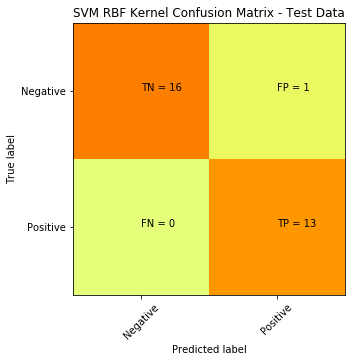
Here is the plot to show the decision boundary
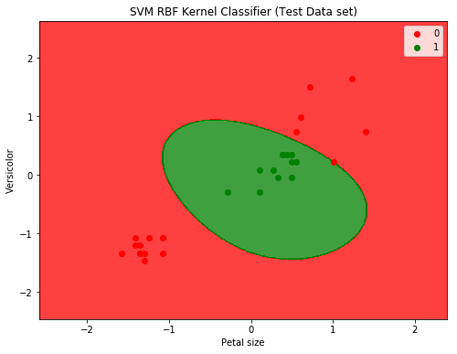
SVM with RBF Kernel produced a significant improvement: down from 15 misclassifications to only 1.
Hope this helps.
note: code was written using Jupyter Notebook
Те, кто работает с данными, отлично знают, что не в нейросетке счастье — а в том, как правильно обработать данные. Но чтобы их обработать, необходимо сначала проанализировать корреляции, выбрать нужные данные, выкинуть ненужные и так далее. Для подобных целей часто используется визуализация с помощью библиотеки matplotlib.

Встретимся «внутри»!
Настройка
Запустите следующий код для настройки. Отдельные диаграммы, впрочем, переопределяют свои настройки сами.
# !pip install brewer2mpl
import numpy as np
import pandas as pd
import matplotlib as mpl
import matplotlib.pyplot as plt
import seaborn as sns
import warnings; warnings.filterwarnings(action='once')

large = 22; med = 16; small = 12
params = {'axes.titlesize': large,
          'legend.fontsize': med,
          'figure.figsize': (16, 10),
          'axes.labelsize': med,
          'axes.titlesize': med,
          'xtick.labelsize': med,
          'ytick.labelsize': med,
          'figure.titlesize': large}
plt.rcParams.update(params)
plt.style.use('seaborn-whitegrid')
sns.set_style("white")
%matplotlib inline

# Version
print(mpl.__version__)  #> 3.0.0
print(sns.__version__)  #> 0.9.0
Корреляция
Графики корреляции используются для визуализации взаимосвязи между 2 или более переменными. То есть, как одна переменная изменяется по отношению к другой.
1. Точечный график
Scatteplot — это классический и фундаментальный вид диаграммы, используемый для изучения взаимосвязи между двумя переменными. Если у вас есть несколько групп в ваших данных, вы можете визуализировать каждую группу в другом цвете. В matplotlib вы можете легко сделать это, используя plt.scatterplot().
Показать код
# Import dataset
midwest = pd.read_csv("https://raw.githubusercontent.com/selva86/datasets/master/midwest_filter.csv")

# Prepare Data
# Create as many colors as there are unique midwest['category']
categories = np.unique(midwest['category'])
colors = [plt.cm.tab10(i/float(len(categories)-1)) for i in range(len(categories))]

# Draw Plot for Each Category
plt.figure(figsize=(16, 10), dpi= 80, facecolor='w', edgecolor='k')

for i, category in enumerate(categories):
    plt.scatter('area', 'poptotal',
                data=midwest.loc[midwest.category==category, :],
                s=20, c=colors[i], label=str(category))

# Decorations
plt.gca().set(xlim=(0.0, 0.1), ylim=(0, 90000),
              xlabel='Area', ylabel='Population')

plt.xticks(fontsize=12); plt.yticks(fontsize=12)
plt.title("Scatterplot of Midwest Area vs Population", fontsize=22)
plt.legend(fontsize=12)
plt.show()

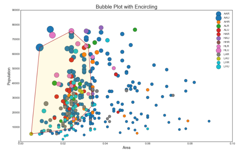
2. Пузырьковая диаграмма с захватом группы
Иногда хочется показать группу точек внутри границы, чтобы подчеркнуть их важность. В этом примере мы получаем записи из фрейма данных, которые должны быть выделены, и передаем их в encircle() описанный в приведенном ниже коде.
Показать код
from matplotlib import patches
from scipy.spatial import ConvexHull
import warnings; warnings.simplefilter('ignore')
sns.set_style("white")

# Step 1: Prepare Data
midwest = pd.read_csv("https://raw.githubusercontent.com/selva86/datasets/master/midwest_filter.csv")

# As many colors as there are unique midwest['category']
categories = np.unique(midwest['category'])
colors = [plt.cm.tab10(i/float(len(categories)-1)) for i in range(len(categories))]

# Step 2: Draw Scatterplot with unique color for each category
fig = plt.figure(figsize=(16, 10), dpi= 80, facecolor='w', edgecolor='k')

for i, category in enumerate(categories):
    plt.scatter('area', 'poptotal', data=midwest.loc[midwest.category==category, :], s='dot_size', c=colors[i], label=str(category), edgecolors='black', linewidths=.5)

# Step 3: Encircling
# https://stackoverflow.com/questions/44575681/how-do-i-encircle-different-data-sets-in-scatter-plot
def encircle(x,y, ax=None, **kw):
    if not ax: ax=plt.gca()
    p = np.c_[x,y]
    hull = ConvexHull(p)
    poly = plt.Polygon(p[hull.vertices,:], **kw)
    ax.add_patch(poly)

# Select data to be encircled
midwest_encircle_data = midwest.loc[midwest.state=='IN', :]

# Draw polygon surrounding vertices
encircle(midwest_encircle_data.area, midwest_encircle_data.poptotal, ec="k", fc="gold", alpha=0.1)
encircle(midwest_encircle_data.area, midwest_encircle_data.poptotal, ec="firebrick", fc="none", linewidth=1.5)

# Step 4: Decorations
plt.gca().set(xlim=(0.0, 0.1), ylim=(0, 90000),
              xlabel='Area', ylabel='Population')

plt.xticks(fontsize=12); plt.yticks(fontsize=12)
plt.title("Bubble Plot with Encircling", fontsize=22)
plt.legend(fontsize=12)
plt.show()
3. График линейной регрессии best fit
Если вы хотите понять, как две переменные изменяются по отношению друг к другу, лучше всего подойдет линия best fit. На графике ниже показано, как best fit отличается среди различных групп данных. Чтобы отключить группировки и просто нарисовать одну линию best fit для всего набора данных, удалите параметр hue=’cyl’ из sns.lmplot() ниже.
Показать код
# Import Data
df = pd.read_csv("https://raw.githubusercontent.com/selva86/datasets/master/mpg_ggplot2.csv")
df_select = df.loc[df.cyl.isin([4,8]), :]

# Plot
sns.set_style("white")
gridobj = sns.lmplot(x="displ", y="hwy", hue="cyl", data=df_select,
                     height=7, aspect=1.6, robust=True, palette='tab10',
                     scatter_kws=dict(s=60, linewidths=.7, edgecolors='black'))

# Decorations
gridobj.set(xlim=(0.5, 7.5), ylim=(0, 50))
plt.title("Scatterplot with line of best fit grouped by number of cylinders", fontsize=20)
plt.show()

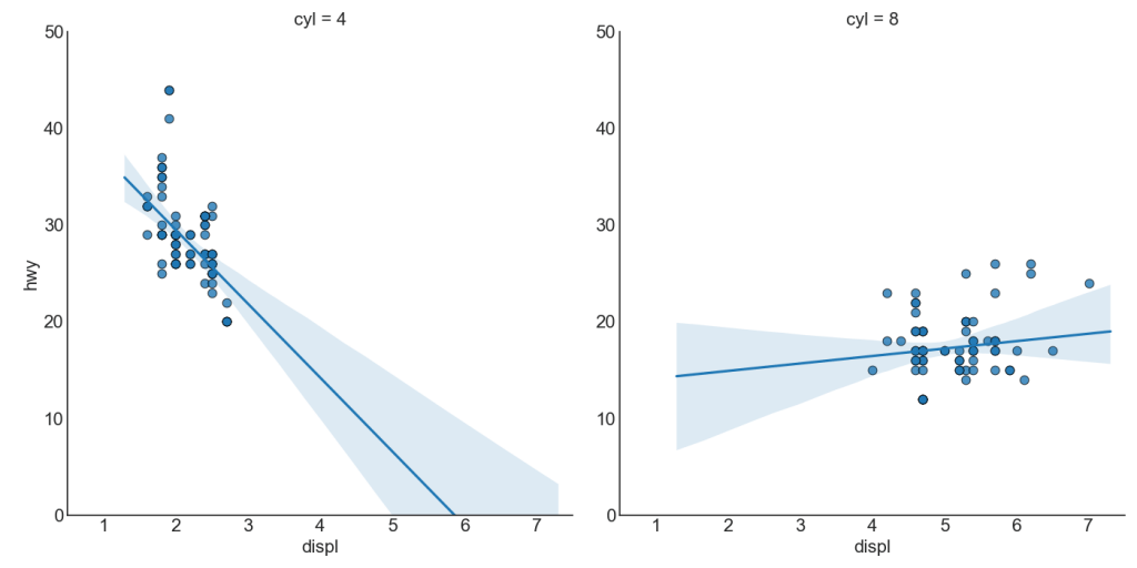
Каждая строка регрессии в своем собственном столбце
Кроме того, вы можете показать линию best fit для каждой группы в отдельном столбце. Вы хотите сделать это, установив параметр col=groupingcolumn внутри sns.lmplot().
Показать код
# Import Data
df = pd.read_csv("https://raw.githubusercontent.com/selva86/datasets/master/mpg_ggplot2.csv")
df_select = df.loc[df.cyl.isin([4,8]), :]

# Each line in its own column
sns.set_style("white")
gridobj = sns.lmplot(x="displ", y="hwy",
                     data=df_select,
                     height=7,
                     robust=True,
                     palette='Set1',
                     col="cyl",
                     scatter_kws=dict(s=60, linewidths=.7, edgecolors='black'))

# Decorations
gridobj.set(xlim=(0.5, 7.5), ylim=(0, 50))
plt.show()
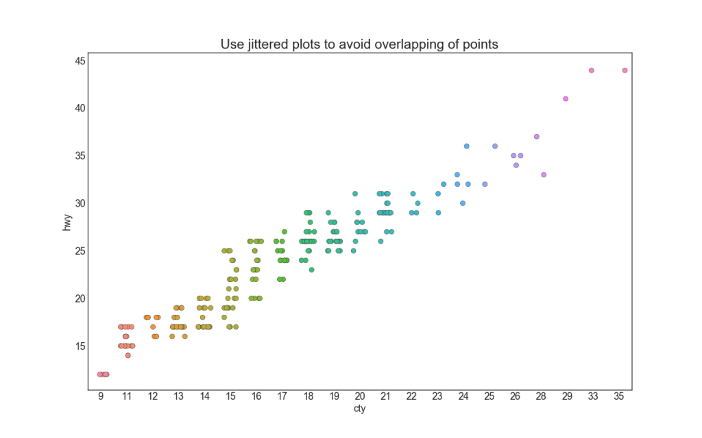
4. Stripplot
Часто несколько точек данных имеют одинаковые значения X и Y. В результате несколько точек наносятся друг на друга и скрываются. Чтобы избежать этого, слегка раздвиньте точки, чтобы вы могли видеть их визуально. Это удобно делать с помощью стрипплота stripplot().
Показать код
# Import Data
df = pd.read_csv("https://raw.githubusercontent.com/selva86/datasets/master/mpg_ggplot2.csv")

# Draw Stripplot
fig, ax = plt.subplots(figsize=(16,10), dpi= 80)
sns.stripplot(df.cty, df.hwy, jitter=0.25, size=8, ax=ax, linewidth=.5)

# Decorations
plt.title('Use jittered plots to avoid overlapping of points', fontsize=22)
plt.show()
5. График подсчета (Counts Plot)
Другим вариантом, позволяющим избежать проблемы наложения точек, является увеличение размера точки в зависимости от того, сколько точек лежит в этом месте. Таким образом, чем больше размер точки, тем больше концентрация точек вокруг нее.
Показать код
# Import Data
df = pd.read_csv("https://raw.githubusercontent.com/selva86/datasets/master/mpg_ggplot2.csv")
df_counts = df.groupby(['hwy', 'cty']).size().reset_index(name='counts')

# Draw Stripplot
fig, ax = plt.subplots(figsize=(16,10), dpi= 80)
sns.scatterplot(df_counts.cty, df_counts.hwy, size=df_counts.counts*2, ax=ax)

# Decorations
plt.title('Counts Plot - Size of circle is bigger as more points overlap', fontsize=22)
plt.show()

6. Построчная гистограмма
Построчные гистограммы имеют гистограмму вдоль переменных оси X и Y. Это используется для визуализации отношений между X и Y вместе с одномерным распределением X и Y по отдельности. Этот график часто используется в анализе данных (EDA).
Показать код
# Import Data
df = pd.read_csv("https://raw.githubusercontent.com/selva86/datasets/master/mpg_ggplot2.csv")

# Create Fig and gridspec
fig = plt.figure(figsize=(16, 10), dpi= 80)
grid = plt.GridSpec(4, 4, hspace=0.5, wspace=0.2)

# Define the axes
ax_main = fig.add_subplot(grid[:-1, :-1])
ax_right = fig.add_subplot(grid[:-1, -1], xticklabels=[], yticklabels=[])
ax_bottom = fig.add_subplot(grid[-1, 0:-1], xticklabels=[], yticklabels=[])

# Scatterplot on main ax
ax_main.scatter('displ', 'hwy', s=df.cty*4, c=df.manufacturer.astype('category').cat.codes, alpha=.9, data=df, cmap="tab10", edgecolors='gray', linewidths=.5)

# histogram on the right
ax_bottom.hist(df.displ, 40, histtype='stepfilled', orientation='vertical', color='deeppink')
ax_bottom.invert_yaxis()

# histogram in the bottom
ax_right.hist(df.hwy, 40, histtype='stepfilled', orientation='horizontal', color='deeppink')

# Decorations
ax_main.set(title='Scatterplot with Histograms n displ vs hwy', xlabel='displ', ylabel='hwy')
ax_main.title.set_fontsize(20)
for item in ([ax_main.xaxis.label, ax_main.yaxis.label] + ax_main.get_xticklabels() + ax_main.get_yticklabels()):
    item.set_fontsize(14)

xlabels = ax_main.get_xticks().tolist()
ax_main.set_xticklabels(xlabels)
plt.show()

7. Boxplot
Boxplot служит той же цели, что и построчная гистограмма. Тем не менее, этот график помогает точно определить медиану, 25-й и 75-й персентили X и Y.
Показать код
# Import Data
df = pd.read_csv("https://raw.githubusercontent.com/selva86/datasets/master/mpg_ggplot2.csv")

# Create Fig and gridspec
fig = plt.figure(figsize=(16, 10), dpi= 80)
grid = plt.GridSpec(4, 4, hspace=0.5, wspace=0.2)

# Define the axes
ax_main = fig.add_subplot(grid[:-1, :-1])
ax_right = fig.add_subplot(grid[:-1, -1], xticklabels=[], yticklabels=[])
ax_bottom = fig.add_subplot(grid[-1, 0:-1], xticklabels=[], yticklabels=[])

# Scatterplot on main ax
ax_main.scatter('displ', 'hwy', s=df.cty*5, c=df.manufacturer.astype('category').cat.codes, alpha=.9, data=df, cmap="Set1", edgecolors='black', linewidths=.5)

# Add a graph in each part
sns.boxplot(df.hwy, ax=ax_right, orient="v")
sns.boxplot(df.displ, ax=ax_bottom, orient="h")

# Decorations ------------------
# Remove x axis name for the boxplot
ax_bottom.set(xlabel='')
ax_right.set(ylabel='')

# Main Title, Xlabel and YLabel
ax_main.set(title='Scatterplot with Histograms n displ vs hwy', xlabel='displ', ylabel='hwy')

# Set font size of different components
ax_main.title.set_fontsize(20)
for item in ([ax_main.xaxis.label, ax_main.yaxis.label] + ax_main.get_xticklabels() + ax_main.get_yticklabels()):
    item.set_fontsize(14)

plt.show()

8. Диаграмма корреляции
Диаграмма корреляции используется для визуального просмотра метрики корреляции между всеми возможными парами числовых переменных в данном наборе данных (или двумерном массиве).
Показать код
# Import Dataset
df = pd.read_csv("https://github.com/selva86/datasets/raw/master/mtcars.csv")

# Plot
plt.figure(figsize=(12,10), dpi= 80)
sns.heatmap(df.corr(), xticklabels=df.corr().columns, yticklabels=df.corr().columns, cmap='RdYlGn', center=0, annot=True)

# Decorations
plt.title('Correlogram of mtcars', fontsize=22)
plt.xticks(fontsize=12)
plt.yticks(fontsize=12)
plt.show()

9. Парный график
Часто используется в исследовательском анализе, чтобы понять взаимосвязь между всеми возможными парами числовых переменных. Это обязательный инструмент для двумерного анализа.
Показать код
# Load Dataset
df = sns.load_dataset('iris')

# Plot
plt.figure(figsize=(10,8), dpi= 80)
sns.pairplot(df, kind="scatter", hue="species", plot_kws=dict(s=80, edgecolor="white", linewidth=2.5))
plt.show()

Показать код
# Load Dataset
df = sns.load_dataset('iris')

# Plot
plt.figure(figsize=(10,8), dpi= 80)
sns.pairplot(df, kind="reg", hue="species")
plt.show()

Отклонение
10. Расходящиеся стобцы
Если вы хотите увидеть, как элементы меняются в зависимости от одной метрики, и визуализировать порядок и величину этой дисперсии, расходящиеся стобцы — отличный инструмент. Он помогает быстро дифференцировать производительность групп в ваших данных, является достаточно интуитивным и мгновенно передает смысл.
Показать код
# Prepare Data
df = pd.read_csv("https://github.com/selva86/datasets/raw/master/mtcars.csv")
x = df.loc[:, ['mpg']]
df['mpg_z'] = (x - x.mean())/x.std()
df['colors'] = ['red' if x < 0 else 'green' for x in df['mpg_z']]
df.sort_values('mpg_z', inplace=True)
df.reset_index(inplace=True)

# Draw plot
plt.figure(figsize=(14,10), dpi= 80)
plt.hlines(y=df.index, xmin=0, xmax=df.mpg_z, color=df.colors, alpha=0.4, linewidth=5)

# Decorations
plt.gca().set(ylabel='$Model$', xlabel='$Mileage$')
plt.yticks(df.index, df.cars, fontsize=12)
plt.title('Diverging Bars of Car Mileage', fontdict={'size':20})
plt.grid(linestyle='--', alpha=0.5)
plt.show()

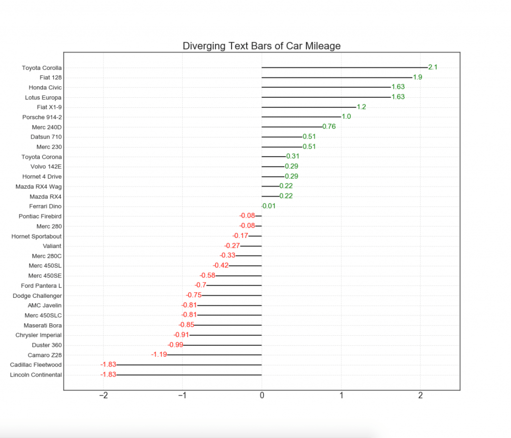
11. Расходящиеся стобцы с текстом
— похожи на расходящиеся столбцы, и это предпочтительнее, если вы хотите показать значимость каждого элемента в диаграмме в хорошем и презентабельном виде.
Показать код
# Prepare Data
df = pd.read_csv("https://github.com/selva86/datasets/raw/master/mtcars.csv")
x = df.loc[:, ['mpg']]
df['mpg_z'] = (x - x.mean())/x.std()
df['colors'] = ['red' if x < 0 else 'green' for x in df['mpg_z']]
df.sort_values('mpg_z', inplace=True)
df.reset_index(inplace=True)

# Draw plot
plt.figure(figsize=(14,14), dpi= 80)
plt.hlines(y=df.index, xmin=0, xmax=df.mpg_z)
for x, y, tex in zip(df.mpg_z, df.index, df.mpg_z):
    t = plt.text(x, y, round(tex, 2), horizontalalignment='right' if x < 0 else 'left',
                 verticalalignment='center', fontdict={'color':'red' if x < 0 else 'green', 'size':14})

# Decorations
plt.yticks(df.index, df.cars, fontsize=12)
plt.title('Diverging Text Bars of Car Mileage', fontdict={'size':20})
plt.grid(linestyle='--', alpha=0.5)
plt.xlim(-2.5, 2.5)
plt.show()
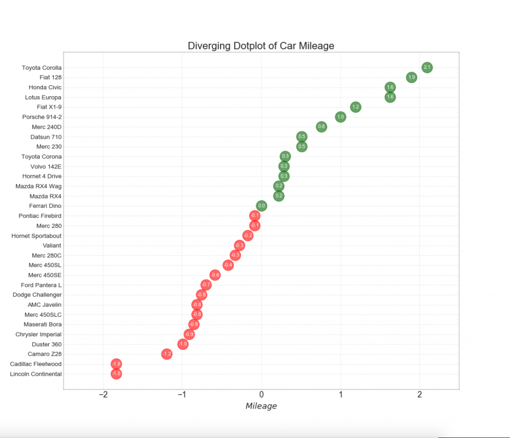
12. Расходящиеся точки
График расходящихся точек также похож на расходящиеся столбцы. Однако по сравнению с расходящимися столбиками, отсутствие столбцов уменьшает степень контрастности и несоответствия между группами.
Показать код
# Prepare Data
df = pd.read_csv("https://github.com/selva86/datasets/raw/master/mtcars.csv")
x = df.loc[:, ['mpg']]
df['mpg_z'] = (x - x.mean())/x.std()
df['colors'] = ['red' if x < 0 else 'darkgreen' for x in df['mpg_z']]
df.sort_values('mpg_z', inplace=True)
df.reset_index(inplace=True)

# Draw plot
plt.figure(figsize=(14,16), dpi= 80)
plt.scatter(df.mpg_z, df.index, s=450, alpha=.6, color=df.colors)
for x, y, tex in zip(df.mpg_z, df.index, df.mpg_z):
    t = plt.text(x, y, round(tex, 1), horizontalalignment='center',
                 verticalalignment='center', fontdict={'color':'white'})

# Decorations
# Lighten borders
plt.gca().spines["top"].set_alpha(.3)
plt.gca().spines["bottom"].set_alpha(.3)
plt.gca().spines["right"].set_alpha(.3)
plt.gca().spines["left"].set_alpha(.3)

plt.yticks(df.index, df.cars)
plt.title('Diverging Dotplot of Car Mileage', fontdict={'size':20})
plt.xlabel('$Mileage$')
plt.grid(linestyle='--', alpha=0.5)
plt.xlim(-2.5, 2.5)
plt.show()
13. Расходящаяся диаграмма Lollipop с маркерами
Lollipop обеспечивает гибкий способ визуализации расхождения, делая акцент на любых значимых точках данных, на которые вы хотите обратить внимание.
Показать код
# Prepare Data
df = pd.read_csv("https://github.com/selva86/datasets/raw/master/mtcars.csv")
x = df.loc[:, ['mpg']]
df['mpg_z'] = (x - x.mean())/x.std()
df['colors'] = 'black'

# color fiat differently
df.loc[df.cars == 'Fiat X1-9', 'colors'] = 'darkorange'
df.sort_values('mpg_z', inplace=True)
df.reset_index(inplace=True)


# Draw plot
import matplotlib.patches as patches

plt.figure(figsize=(14,16), dpi= 80)
plt.hlines(y=df.index, xmin=0, xmax=df.mpg_z, color=df.colors, alpha=0.4, linewidth=1)
plt.scatter(df.mpg_z, df.index, color=df.colors, s=[600 if x == 'Fiat X1-9' else 300 for x in df.cars], alpha=0.6)
plt.yticks(df.index, df.cars)
plt.xticks(fontsize=12)

# Annotate
plt.annotate('Mercedes Models', xy=(0.0, 11.0), xytext=(1.0, 11), xycoords='data',
            fontsize=15, ha='center', va='center',
            bbox=dict(boxstyle='square', fc='firebrick'),
            arrowprops=dict(arrowstyle='-[, widthB=2.0, lengthB=1.5', lw=2.0, color='steelblue'), color='white')

# Add Patches
p1 = patches.Rectangle((-2.0, -1), width=.3, height=3, alpha=.2, facecolor='red')
p2 = patches.Rectangle((1.5, 27), width=.8, height=5, alpha=.2, facecolor='green')
plt.gca().add_patch(p1)
plt.gca().add_patch(p2)

# Decorate
plt.title('Diverging Bars of Car Mileage', fontdict={'size':20})
plt.grid(linestyle='--', alpha=0.5)
plt.show()

14. Диаграмма площади
Раскрашивая область между осью и линиями, диаграмма площади подчеркивает пики и впадины, но и на продолжительности максимумов и минимумов. Чем больше продолжительность максимумов, тем больше площадь под линией.
Показать код
import numpy as np
import pandas as pd

# Prepare Data
df = pd.read_csv("https://github.com/selva86/datasets/raw/master/economics.csv", parse_dates=['date']).head(100)
x = np.arange(df.shape[0])
y_returns = (df.psavert.diff().fillna(0)/df.psavert.shift(1)).fillna(0) * 100

# Plot
plt.figure(figsize=(16,10), dpi= 80)
plt.fill_between(x[1:], y_returns[1:], 0, where=y_returns[1:] >= 0, facecolor='green', interpolate=True, alpha=0.7)
plt.fill_between(x[1:], y_returns[1:], 0, where=y_returns[1:] <= 0, facecolor='red', interpolate=True, alpha=0.7)

# Annotate
plt.annotate('Peak n1975', xy=(94.0, 21.0), xytext=(88.0, 28),
             bbox=dict(boxstyle='square', fc='firebrick'),
             arrowprops=dict(facecolor='steelblue', shrink=0.05), fontsize=15, color='white')


# Decorations
xtickvals = [str(m)[:3].upper()+"-"+str(y) for y,m in zip(df.date.dt.year, df.date.dt.month_name())]
plt.gca().set_xticks(x[::6])
plt.gca().set_xticklabels(xtickvals[::6], rotation=90, fontdict={'horizontalalignment': 'center', 'verticalalignment': 'center_baseline'})
plt.ylim(-35,35)
plt.xlim(1,100)
plt.title("Month Economics Return %", fontsize=22)
plt.ylabel('Monthly returns %')
plt.grid(alpha=0.5)
plt.show()

Ранжирование
15. Упорядоченная гистограмма
Упорядоченная гистограмма эффективно передает порядок ранжирования элементов. Но, добавив значение показателя над диаграммой, пользователь получает точную информацию от самой диаграммы.
Показать код
# Prepare Data
df_raw = pd.read_csv("https://github.com/selva86/datasets/raw/master/mpg_ggplot2.csv")
df = df_raw[['cty', 'manufacturer']].groupby('manufacturer').apply(lambda x: x.mean())
df.sort_values('cty', inplace=True)
df.reset_index(inplace=True)

# Draw plot
import matplotlib.patches as patches

fig, ax = plt.subplots(figsize=(16,10), facecolor='white', dpi= 80)
ax.vlines(x=df.index, ymin=0, ymax=df.cty, color='firebrick', alpha=0.7, linewidth=20)

# Annotate Text
for i, cty in enumerate(df.cty):
    ax.text(i, cty+0.5, round(cty, 1), horizontalalignment='center')


# Title, Label, Ticks and Ylim
ax.set_title('Bar Chart for Highway Mileage', fontdict={'size':22})
ax.set(ylabel='Miles Per Gallon', ylim=(0, 30))
plt.xticks(df.index, df.manufacturer.str.upper(), rotation=60, horizontalalignment='right', fontsize=12)

# Add patches to color the X axis labels
p1 = patches.Rectangle((.57, -0.005), width=.33, height=.13, alpha=.1, facecolor='green', transform=fig.transFigure)
p2 = patches.Rectangle((.124, -0.005), width=.446, height=.13, alpha=.1, facecolor='red', transform=fig.transFigure)
fig.add_artist(p1)
fig.add_artist(p2)
plt.show()

16. Диаграмма Lollipop
Диаграмма Lollipop служит аналогичной цели как упорядоченная гистограмма визуально приятным способом.
Показать код
# Prepare Data
df_raw = pd.read_csv("https://github.com/selva86/datasets/raw/master/mpg_ggplot2.csv")
df = df_raw[['cty', 'manufacturer']].groupby('manufacturer').apply(lambda x: x.mean())
df.sort_values('cty', inplace=True)
df.reset_index(inplace=True)

# Draw plot
fig, ax = plt.subplots(figsize=(16,10), dpi= 80)
ax.vlines(x=df.index, ymin=0, ymax=df.cty, color='firebrick', alpha=0.7, linewidth=2)
ax.scatter(x=df.index, y=df.cty, s=75, color='firebrick', alpha=0.7)

# Title, Label, Ticks and Ylim
ax.set_title('Lollipop Chart for Highway Mileage', fontdict={'size':22})
ax.set_ylabel('Miles Per Gallon')
ax.set_xticks(df.index)
ax.set_xticklabels(df.manufacturer.str.upper(), rotation=60, fontdict={'horizontalalignment': 'right', 'size':12})
ax.set_ylim(0, 30)

# Annotate
for row in df.itertuples():
    ax.text(row.Index, row.cty+.5, s=round(row.cty, 2), horizontalalignment= 'center', verticalalignment='bottom', fontsize=14)

plt.show()

17. Поточечный график с подписями
Точечный график передает порядок ранжирования предметов. А поскольку он выровнен вдоль горизонтальной оси, вы можете визуально оценить, как далеко точки находятся друг от друга.
Показать код
# Prepare Data
df_raw = pd.read_csv("https://github.com/selva86/datasets/raw/master/mpg_ggplot2.csv")
df = df_raw[['cty', 'manufacturer']].groupby('manufacturer').apply(lambda x: x.mean())
df.sort_values('cty', inplace=True)
df.reset_index(inplace=True)

# Draw plot
fig, ax = plt.subplots(figsize=(16,10), dpi= 80)
ax.hlines(y=df.index, xmin=11, xmax=26, color='gray', alpha=0.7, linewidth=1, linestyles='dashdot')
ax.scatter(y=df.index, x=df.cty, s=75, color='firebrick', alpha=0.7)

# Title, Label, Ticks and Ylim
ax.set_title('Dot Plot for Highway Mileage', fontdict={'size':22})
ax.set_xlabel('Miles Per Gallon')
ax.set_yticks(df.index)
ax.set_yticklabels(df.manufacturer.str.title(), fontdict={'horizontalalignment': 'right'})
ax.set_xlim(10, 27)
plt.show()
18. Наклонная карта
Диаграмма уклона наиболее подходит для сравнения позиций «До» и «После» данного человека / предмета.
Показать код
import matplotlib.lines as mlines
# Import Data
df = pd.read_csv("https://raw.githubusercontent.com/selva86/datasets/master/gdppercap.csv")

left_label = [str(c) + ', '+ str(round(y)) for c, y in zip(df.continent, df['1952'])]
right_label = [str(c) + ', '+ str(round(y)) for c, y in zip(df.continent, df['1957'])]
klass = ['red' if (y1-y2) < 0 else 'green' for y1, y2 in zip(df['1952'], df['1957'])]

# draw line
# https://stackoverflow.com/questions/36470343/how-to-draw-a-line-with-matplotlib/36479941
def newline(p1, p2, color='black'):
    ax = plt.gca()
    l = mlines.Line2D([p1[0],p2[0]], [p1[1],p2[1]], color='red' if p1[1]-p2[1] > 0 else 'green', marker='o', markersize=6)
    ax.add_line(l)
    return l

fig, ax = plt.subplots(1,1,figsize=(14,14), dpi= 80)

# Vertical Lines
ax.vlines(x=1, ymin=500, ymax=13000, color='black', alpha=0.7, linewidth=1, linestyles='dotted')
ax.vlines(x=3, ymin=500, ymax=13000, color='black', alpha=0.7, linewidth=1, linestyles='dotted')

# Points
ax.scatter(y=df['1952'], x=np.repeat(1, df.shape[0]), s=10, color='black', alpha=0.7)
ax.scatter(y=df['1957'], x=np.repeat(3, df.shape[0]), s=10, color='black', alpha=0.7)

# Line Segmentsand Annotation
for p1, p2, c in zip(df['1952'], df['1957'], df['continent']):
    newline([1,p1], [3,p2])
    ax.text(1-0.05, p1, c + ', ' + str(round(p1)), horizontalalignment='right', verticalalignment='center', fontdict={'size':14})
    ax.text(3+0.05, p2, c + ', ' + str(round(p2)), horizontalalignment='left', verticalalignment='center', fontdict={'size':14})

# 'Before' and 'After' Annotations
ax.text(1-0.05, 13000, 'BEFORE', horizontalalignment='right', verticalalignment='center', fontdict={'size':18, 'weight':700})
ax.text(3+0.05, 13000, 'AFTER', horizontalalignment='left', verticalalignment='center', fontdict={'size':18, 'weight':700})

# Decoration
ax.set_title("Slopechart: Comparing GDP Per Capita between 1952 vs 1957", fontdict={'size':22})
ax.set(xlim=(0,4), ylim=(0,14000), ylabel='Mean GDP Per Capita')
ax.set_xticks([1,3])
ax.set_xticklabels(["1952", "1957"])
plt.yticks(np.arange(500, 13000, 2000), fontsize=12)

# Lighten borders
plt.gca().spines["top"].set_alpha(.0)
plt.gca().spines["bottom"].set_alpha(.0)
plt.gca().spines["right"].set_alpha(.0)
plt.gca().spines["left"].set_alpha(.0)
plt.show()
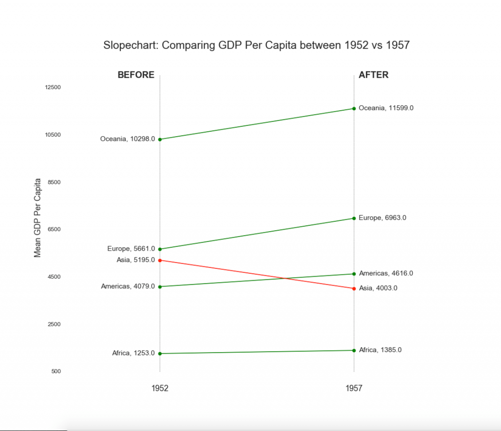
19. «Гантели»
График «Гантели» передает позиции «до» и «после» различных влияний, а также порядок ранжирования предметов. Это очень полезно, если вы хотите визуализировать влияние чего-либо на разные объекты.
Показать код
import matplotlib.lines as mlines

# Import Data
df = pd.read_csv("https://raw.githubusercontent.com/selva86/datasets/master/health.csv")
df.sort_values('pct_2014', inplace=True)
df.reset_index(inplace=True)

# Func to draw line segment
def newline(p1, p2, color='black'):
    ax = plt.gca()
    l = mlines.Line2D([p1[0],p2[0]], [p1[1],p2[1]], color='skyblue')
    ax.add_line(l)
    return l

# Figure and Axes
fig, ax = plt.subplots(1,1,figsize=(14,14), facecolor='#f7f7f7', dpi= 80)

# Vertical Lines
ax.vlines(x=.05, ymin=0, ymax=26, color='black', alpha=1, linewidth=1, linestyles='dotted')
ax.vlines(x=.10, ymin=0, ymax=26, color='black', alpha=1, linewidth=1, linestyles='dotted')
ax.vlines(x=.15, ymin=0, ymax=26, color='black', alpha=1, linewidth=1, linestyles='dotted')
ax.vlines(x=.20, ymin=0, ymax=26, color='black', alpha=1, linewidth=1, linestyles='dotted')

# Points
ax.scatter(y=df['index'], x=df['pct_2013'], s=50, color='#0e668b', alpha=0.7)
ax.scatter(y=df['index'], x=df['pct_2014'], s=50, color='#a3c4dc', alpha=0.7)

# Line Segments
for i, p1, p2 in zip(df['index'], df['pct_2013'], df['pct_2014']):
    newline([p1, i], [p2, i])

# Decoration
ax.set_facecolor('#f7f7f7')
ax.set_title("Dumbell Chart: Pct Change - 2013 vs 2014", fontdict={'size':22})
ax.set(xlim=(0,.25), ylim=(-1, 27), ylabel='Mean GDP Per Capita')
ax.set_xticks([.05, .1, .15, .20])
ax.set_xticklabels(['5%', '15%', '20%', '25%'])
ax.set_xticklabels(['5%', '15%', '20%', '25%'])
plt.show()

Распределение
20. Гистограмма для непрерывной переменной
Гистограмма показывает распределение частот данной переменной. Приведенное ниже представление группирует полосы частот на основе категориальной переменной.
Показать код
# Import Data
df = pd.read_csv("https://github.com/selva86/datasets/raw/master/mpg_ggplot2.csv")

# Prepare data
x_var = 'displ'
groupby_var = 'class'
df_agg = df.loc[:, [x_var, groupby_var]].groupby(groupby_var)
vals = [df[x_var].values.tolist() for i, df in df_agg]

# Draw
plt.figure(figsize=(16,9), dpi= 80)
colors = [plt.cm.Spectral(i/float(len(vals)-1)) for i in range(len(vals))]
n, bins, patches = plt.hist(vals, 30, stacked=True, density=False, color=colors[:len(vals)])

# Decoration
plt.legend({group:col for group, col in zip(np.unique(df[groupby_var]).tolist(), colors[:len(vals)])})
plt.title(f"Stacked Histogram of ${x_var}$ colored by ${groupby_var}$", fontsize=22)
plt.xlabel(x_var)
plt.ylabel("Frequency")
plt.ylim(0, 25)
plt.xticks(ticks=bins[::3], labels=[round(b,1) for b in bins[::3]])
plt.show()

21. Гистограмма для категориальной переменной
Гистограмма категориальной переменной показывает распределение частоты этой переменной. Раскрашивая столбцы, вы можете визуализировать распределение в связи с другой категориальной переменной, представляющей цвета.
Показать код
# Import Data
df = pd.read_csv("https://github.com/selva86/datasets/raw/master/mpg_ggplot2.csv")

# Prepare data
x_var = 'manufacturer'
groupby_var = 'class'
df_agg = df.loc[:, [x_var, groupby_var]].groupby(groupby_var)
vals = [df[x_var].values.tolist() for i, df in df_agg]

# Draw
plt.figure(figsize=(16,9), dpi= 80)
colors = [plt.cm.Spectral(i/float(len(vals)-1)) for i in range(len(vals))]
n, bins, patches = plt.hist(vals, df[x_var].unique().__len__(), stacked=True, density=False, color=colors[:len(vals)])

# Decoration
plt.legend({group:col for group, col in zip(np.unique(df[groupby_var]).tolist(), colors[:len(vals)])})
plt.title(f"Stacked Histogram of ${x_var}$ colored by ${groupby_var}$", fontsize=22)
plt.xlabel(x_var)
plt.ylabel("Frequency")
plt.ylim(0, 40)
plt.xticks(ticks=bins, labels=np.unique(df[x_var]).tolist(), rotation=90, horizontalalignment='left')
plt.show()
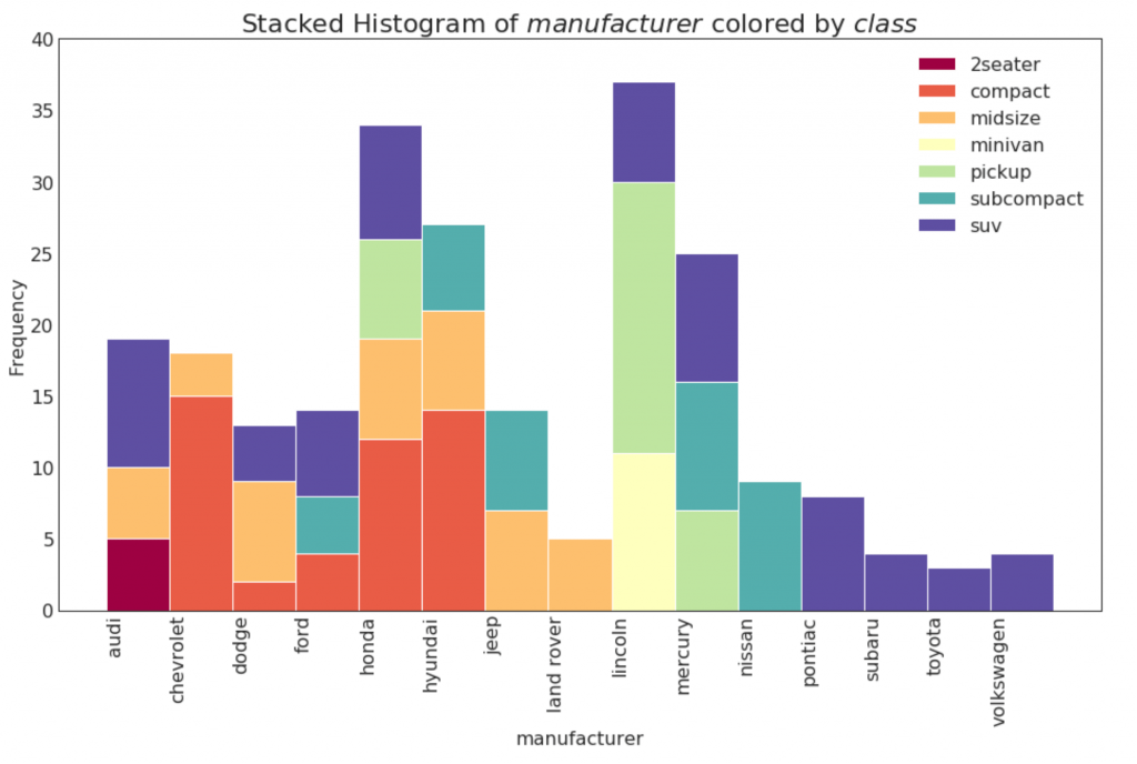
22. График плотности
Графики плотности являются широко используемым инструментом для визуализации распределения непрерывной переменной. Сгруппировав их по переменной «response», вы можете проверить взаимосвязь между X и Y. Ниже представлен пример, если для наглядности описать, как распределение пробега по городу меняется в зависимости от количества цилиндров.
Показать код
# Import Data
df = pd.read_csv("https://github.com/selva86/datasets/raw/master/mpg_ggplot2.csv")

# Draw Plot
plt.figure(figsize=(16,10), dpi= 80)
sns.kdeplot(df.loc[df['cyl'] == 4, "cty"], shade=True, color="g", label="Cyl=4", alpha=.7)
sns.kdeplot(df.loc[df['cyl'] == 5, "cty"], shade=True, color="deeppink", label="Cyl=5", alpha=.7)
sns.kdeplot(df.loc[df['cyl'] == 6, "cty"], shade=True, color="dodgerblue", label="Cyl=6", alpha=.7)
sns.kdeplot(df.loc[df['cyl'] == 8, "cty"], shade=True, color="orange", label="Cyl=8", alpha=.7)

# Decoration
plt.title('Density Plot of City Mileage by n_Cylinders', fontsize=22)
plt.legend()
plt.show()
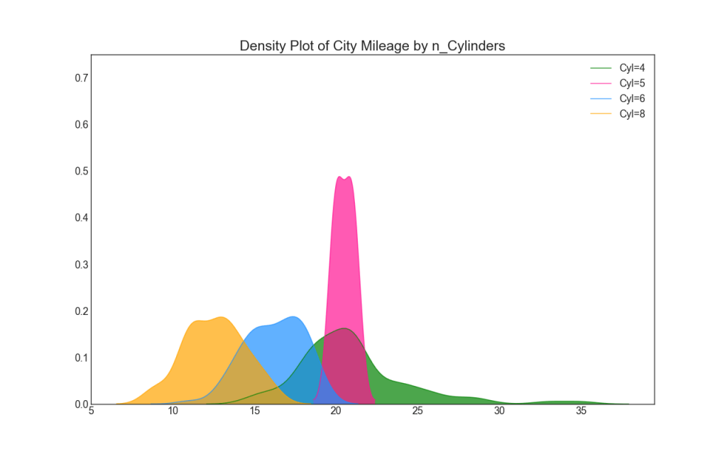
23. Кривые плотности с гистограммой
Кривая плотности с гистограммой объединяет сводную информацию, передаваемую двумя графиками, так что вы можете видеть оба в одном месте.
Показать код
# Import Data
df = pd.read_csv("https://github.com/selva86/datasets/raw/master/mpg_ggplot2.csv")

# Draw Plot
plt.figure(figsize=(13,10), dpi= 80)
sns.distplot(df.loc[df['class'] == 'compact', "cty"], color="dodgerblue", label="Compact", hist_kws={'alpha':.7}, kde_kws={'linewidth':3})
sns.distplot(df.loc[df['class'] == 'suv', "cty"], color="orange", label="SUV", hist_kws={'alpha':.7}, kde_kws={'linewidth':3})
sns.distplot(df.loc[df['class'] == 'minivan', "cty"], color="g", label="minivan", hist_kws={'alpha':.7}, kde_kws={'linewidth':3})
plt.ylim(0, 0.35)

# Decoration
plt.title('Density Plot of City Mileage by Vehicle Type', fontsize=22)
plt.legend()
plt.show()

24. График Joy
График Joy позволяет перекрывать кривые плотности разных групп, это отличный способ визуализировать распределение большого числа групп по отношению друг к другу. Это выглядит приятным для глаз и четко передает только правильную информацию.
Показать код
# !pip install joypy
# Import Data
mpg = pd.read_csv("https://github.com/selva86/datasets/raw/master/mpg_ggplot2.csv")

# Draw Plot
plt.figure(figsize=(16,10), dpi= 80)
fig, axes = joypy.joyplot(mpg, column=['hwy', 'cty'], by="class", ylim='own', figsize=(14,10))

# Decoration
plt.title('Joy Plot of City and Highway Mileage by Class', fontsize=22)
plt.show()
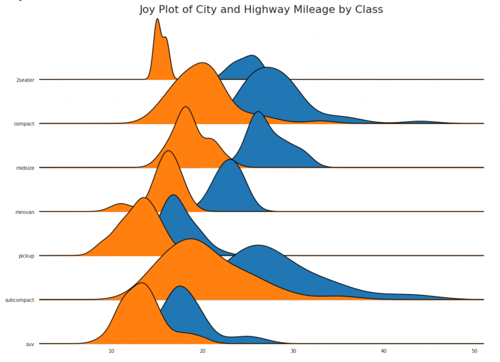
25. Распределенная точечная диаграмма
Распределенная точечная диаграмма показывает одномерное распределение точек, сегментированных по группам. Чем темнее точки, тем больше концентрация точек данных в этом регионе. По-разному окрашивая медиану, реальное расположение групп становится очевидным мгновенно.
Показать код
import matplotlib.patches as mpatches

# Prepare Data
df_raw = pd.read_csv("https://github.com/selva86/datasets/raw/master/mpg_ggplot2.csv")
cyl_colors = {4:'tab:red', 5:'tab:green', 6:'tab:blue', 8:'tab:orange'}
df_raw['cyl_color'] = df_raw.cyl.map(cyl_colors)

# Mean and Median city mileage by make
df = df_raw[['cty', 'manufacturer']].groupby('manufacturer').apply(lambda x: x.mean())
df.sort_values('cty', ascending=False, inplace=True)
df.reset_index(inplace=True)
df_median = df_raw[['cty', 'manufacturer']].groupby('manufacturer').apply(lambda x: x.median())

# Draw horizontal lines
fig, ax = plt.subplots(figsize=(16,10), dpi= 80)
ax.hlines(y=df.index, xmin=0, xmax=40, color='gray', alpha=0.5, linewidth=.5, linestyles='dashdot')

# Draw the Dots
for i, make in enumerate(df.manufacturer):
    df_make = df_raw.loc[df_raw.manufacturer==make, :]
    ax.scatter(y=np.repeat(i, df_make.shape[0]), x='cty', data=df_make, s=75, edgecolors='gray', c='w', alpha=0.5)
    ax.scatter(y=i, x='cty', data=df_median.loc[df_median.index==make, :], s=75, c='firebrick')

# Annotate
ax.text(33, 13, "$red ; dots ; are ; the : median$", fontdict={'size':12}, color='firebrick')

# Decorations
red_patch = plt.plot([],[], marker="o", ms=10, ls="", mec=None, color='firebrick', label="Median")
plt.legend(handles=red_patch)
ax.set_title('Distribution of City Mileage by Make', fontdict={'size':22})
ax.set_xlabel('Miles Per Gallon (City)', alpha=0.7)
ax.set_yticks(df.index)
ax.set_yticklabels(df.manufacturer.str.title(), fontdict={'horizontalalignment': 'right'}, alpha=0.7)
ax.set_xlim(1, 40)
plt.xticks(alpha=0.7)
plt.gca().spines["top"].set_visible(False)
plt.gca().spines["bottom"].set_visible(False)
plt.gca().spines["right"].set_visible(False)
plt.gca().spines["left"].set_visible(False)
plt.grid(axis='both', alpha=.4, linewidth=.1)
plt.show()

26. Графики с прямоугольниками
Такие графики — отличный способ визуализировать распределение, зная медиану, 25-й, 75-й квартили и максимумы с минимумами. Однако вы должны быть осторожны при интерпретации размера полей, которые могут потенциально исказить количество точек, содержащихся в этой группе. Таким образом, ручное указание количества наблюдений в каждой ячейке поможет преодолеть этот недостаток.
Например, первые два прямоугольника слева одинакового размера, хотя они имеют 5 и 47 элементов данных соответственно. Поэтому необходимо отмечать количество наблюдений.
Показать код
# Import Data
df = pd.read_csv("https://github.com/selva86/datasets/raw/master/mpg_ggplot2.csv")

# Draw Plot
plt.figure(figsize=(13,10), dpi= 80)
sns.boxplot(x='class', y='hwy', data=df, notch=False)

# Add N Obs inside boxplot (optional)
def add_n_obs(df,group_col,y):
    medians_dict = {grp[0]:grp[1][y].median() for grp in df.groupby(group_col)}
    xticklabels = [x.get_text() for x in plt.gca().get_xticklabels()]
    n_obs = df.groupby(group_col)[y].size().values
    for (x, xticklabel), n_ob in zip(enumerate(xticklabels), n_obs):
        plt.text(x, medians_dict[xticklabel]*1.01, "#obs : "+str(n_ob), horizontalalignment='center', fontdict={'size':14}, color='white')

add_n_obs(df,group_col='class',y='hwy')

# Decoration
plt.title('Box Plot of Highway Mileage by Vehicle Class', fontsize=22)
plt.ylim(10, 40)
plt.show()

27. Графики с прямоугольниками и точками
Dot + Box plot передает аналогичную информацию, как boxplot, разбитый на группы. Кроме того, точки дают представление о количестве элементов данных в каждой группе.
Показать код
# Import Data
df = pd.read_csv("https://github.com/selva86/datasets/raw/master/mpg_ggplot2.csv")

# Draw Plot
plt.figure(figsize=(13,10), dpi= 80)
sns.boxplot(x='class', y='hwy', data=df, hue='cyl')
sns.stripplot(x='class', y='hwy', data=df, color='black', size=3, jitter=1)

for i in range(len(df['class'].unique())-1):
    plt.vlines(i+.5, 10, 45, linestyles='solid', colors='gray', alpha=0.2)

# Decoration
plt.title('Box Plot of Highway Mileage by Vehicle Class', fontsize=22)
plt.legend(title='Cylinders')
plt.show()

28. График «скрипками»
Такой график — это визуально приятная альтернатива boxplot. Форма или площадь «скрипки» зависит от количества данных в этой группе. Тем не менее, такие графики могут быть сложнее для чтения, и они обычно не используются в профессиональных условиях.
Показать код
# Import Data
df = pd.read_csv("https://github.com/selva86/datasets/raw/master/mpg_ggplot2.csv")

# Draw Plot
plt.figure(figsize=(13,10), dpi= 80)
sns.violinplot(x='class', y='hwy', data=df, scale='width', inner='quartile')

# Decoration
plt.title('Violin Plot of Highway Mileage by Vehicle Class', fontsize=22)
plt.show()

29. Пирамида населенности
Популяционная пирамида может использоваться, чтобы показать распределение групп, упорядоченных по объему, или для показа поэтапной фильтрации населения, как это показано ниже, чтобы визуализировать, сколько людей проходит через каждую стадию воронки маркетинга.
Показать код
# Read data
df = pd.read_csv("https://raw.githubusercontent.com/selva86/datasets/master/email_campaign_funnel.csv")

# Draw Plot
plt.figure(figsize=(13,10), dpi= 80)
group_col = 'Gender'
order_of_bars = df.Stage.unique()[::-1]
colors = [plt.cm.Spectral(i/float(len(df[group_col].unique())-1)) for i in range(len(df[group_col].unique()))]

for c, group in zip(colors, df[group_col].unique()):
    sns.barplot(x='Users', y='Stage', data=df.loc[df[group_col]==group, :], order=order_of_bars, color=c, label=group)

# Decorations
plt.xlabel("$Users$")
plt.ylabel("Stage of Purchase")
plt.yticks(fontsize=12)
plt.title("Population Pyramid of the Marketing Funnel", fontsize=22)
plt.legend()
plt.show()

30. Категориальные графики
Категориальные графики, предоставленные библиотекой seaborn, можно использовать для визуализации распределения количества двух или более категориальных переменных по отношению друг к другу.
Показать код
# Load Dataset
titanic = sns.load_dataset("titanic")

# Plot
g = sns.catplot("alive", col="deck", col_wrap=4,
                data=titanic[titanic.deck.notnull()],
                kind="count", height=3.5, aspect=.8,
                palette='tab20')

fig.suptitle('sf')
plt.show()

Показать код
# Load Dataset
titanic = sns.load_dataset("titanic")

# Plot
sns.catplot(x="age", y="embark_town",
            hue="sex", col="class",
            data=titanic[titanic.embark_town.notnull()],
            orient="h", height=5, aspect=1, palette="tab10",
            kind="violin", dodge=True, cut=0, bw=.2)
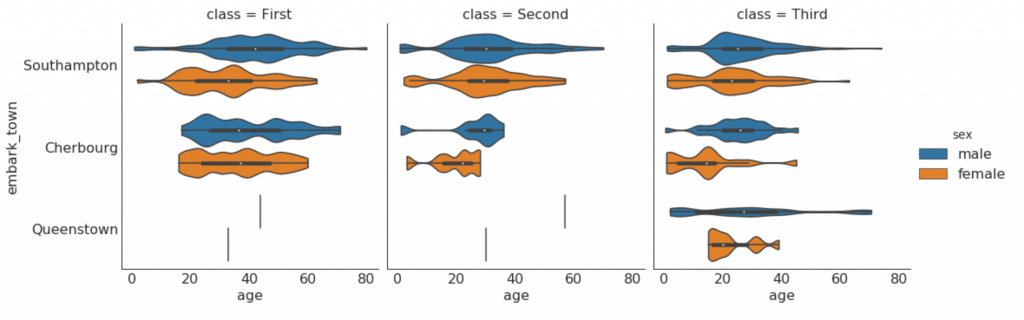
Сборка, композиция
31. Вафельная диаграмма
waffle график может быть создан с помощью pywaffle пакета и используется для отображения композиций групп в большей части населения.
Показать код
#! pip install pywaffle
# Reference: https://stackoverflow.com/questions/41400136/how-to-do-waffle-charts-in-python-square-piechart
from pywaffle import Waffle

# Import
df_raw = pd.read_csv("https://github.com/selva86/datasets/raw/master/mpg_ggplot2.csv")

# Prepare Data
df = df_raw.groupby('class').size().reset_index(name='counts')
n_categories = df.shape[0]
colors = [plt.cm.inferno_r(i/float(n_categories)) for i in range(n_categories)]

# Draw Plot and Decorate
fig = plt.figure(
    FigureClass=Waffle,
    plots={
        '111': {
            'values': df['counts'],
            'labels': ["{0} ({1})".format(n[0], n[1]) for n in df[['class', 'counts']].itertuples()],
            'legend': {'loc': 'upper left', 'bbox_to_anchor': (1.05, 1), 'fontsize': 12},
            'title': {'label': '# Vehicles by Class', 'loc': 'center', 'fontsize':18}
        },
    },
    rows=7,
    colors=colors,
    figsize=(16, 9)
)

Показать код
#! pip install pywaffle
from pywaffle import Waffle

# Import
# df_raw = pd.read_csv("https://github.com/selva86/datasets/raw/master/mpg_ggplot2.csv")

# Prepare Data
# By Class Data
df_class = df_raw.groupby('class').size().reset_index(name='counts_class')
n_categories = df_class.shape[0]
colors_class = [plt.cm.Set3(i/float(n_categories)) for i in range(n_categories)]

# By Cylinders Data
df_cyl = df_raw.groupby('cyl').size().reset_index(name='counts_cyl')
n_categories = df_cyl.shape[0]
colors_cyl = [plt.cm.Spectral(i/float(n_categories)) for i in range(n_categories)]

# By Make Data
df_make = df_raw.groupby('manufacturer').size().reset_index(name='counts_make')
n_categories = df_make.shape[0]
colors_make = [plt.cm.tab20b(i/float(n_categories)) for i in range(n_categories)]


# Draw Plot and Decorate
fig = plt.figure(
    FigureClass=Waffle,
    plots={
        '311': {
            'values': df_class['counts_class'],
            'labels': ["{1}".format(n[0], n[1]) for n in df_class[['class', 'counts_class']].itertuples()],
            'legend': {'loc': 'upper left', 'bbox_to_anchor': (1.05, 1), 'fontsize': 12, 'title':'Class'},
            'title': {'label': '# Vehicles by Class', 'loc': 'center', 'fontsize':18},
            'colors': colors_class
        },
        '312': {
            'values': df_cyl['counts_cyl'],
            'labels': ["{1}".format(n[0], n[1]) for n in df_cyl[['cyl', 'counts_cyl']].itertuples()],
            'legend': {'loc': 'upper left', 'bbox_to_anchor': (1.05, 1), 'fontsize': 12, 'title':'Cyl'},
            'title': {'label': '# Vehicles by Cyl', 'loc': 'center', 'fontsize':18},
            'colors': colors_cyl
        },
        '313': {
            'values': df_make['counts_make'],
            'labels': ["{1}".format(n[0], n[1]) for n in df_make[['manufacturer', 'counts_make']].itertuples()],
            'legend': {'loc': 'upper left', 'bbox_to_anchor': (1.05, 1), 'fontsize': 12, 'title':'Manufacturer'},
            'title': {'label': '# Vehicles by Make', 'loc': 'center', 'fontsize':18},
            'colors': colors_make
        }
    },
    rows=9,
    figsize=(16, 14)
)
32. Круговая диаграмма
Круговая диаграмма — это классический способ показать состав групп. Тем не менее, в настоящее время, как правило, не рекомендуется использовать этот график, потому что площадь сегментов может иногда вводить в заблуждение. Поэтому, если вы хотите использовать круговую диаграмму, настоятельно рекомендуется явно записать процент или число для каждой части круговой диаграммы.
Показать код
# Import
df_raw = pd.read_csv("https://github.com/selva86/datasets/raw/master/mpg_ggplot2.csv")

# Prepare Data
df = df_raw.groupby('class').size()

# Make the plot with pandas
df.plot(kind='pie', subplots=True, figsize=(8, 8), dpi= 80)
plt.title("Pie Chart of Vehicle Class - Bad")
plt.ylabel("")
plt.show()
Показать код
# Import
df_raw = pd.read_csv("https://github.com/selva86/datasets/raw/master/mpg_ggplot2.csv")

# Prepare Data
df = df_raw.groupby('class').size().reset_index(name='counts')

# Draw Plot
fig, ax = plt.subplots(figsize=(12, 7), subplot_kw=dict(aspect="equal"), dpi= 80)

data = df['counts']
categories = df['class']
explode = [0,0,0,0,0,0.1,0]

def func(pct, allvals):
    absolute = int(pct/100.*np.sum(allvals))
    return "{:.1f}% ({:d} )".format(pct, absolute)

wedges, texts, autotexts = ax.pie(data,
                                  autopct=lambda pct: func(pct, data),
                                  textprops=dict(color="w"),
                                  colors=plt.cm.Dark2.colors,
                                 startangle=140,
                                 explode=explode)

# Decoration
ax.legend(wedges, categories, title="Vehicle Class", loc="center left", bbox_to_anchor=(1, 0, 0.5, 1))
plt.setp(autotexts, size=10, weight=700)
ax.set_title("Class of Vehicles: Pie Chart")
plt.show()

33. Древовидная карта
Древовидная карта похожа на круговую диаграмму и работает лучше, не вводя в заблуждение долю каждой группы.
Показать код
# pip install squarify
import squarify

# Import Data
df_raw = pd.read_csv("https://github.com/selva86/datasets/raw/master/mpg_ggplot2.csv")

# Prepare Data
df = df_raw.groupby('class').size().reset_index(name='counts')
labels = df.apply(lambda x: str(x[0]) + "n (" + str(x[1]) + ")", axis=1)
sizes = df['counts'].values.tolist()
colors = [plt.cm.Spectral(i/float(len(labels))) for i in range(len(labels))]

# Draw Plot
plt.figure(figsize=(12,8), dpi= 80)
squarify.plot(sizes=sizes, label=labels, color=colors, alpha=.8)

# Decorate
plt.title('Treemap of Vechile Class')
plt.axis('off')
plt.show()

34. Гистограмма
Гистограмма — это классический способ визуализации элементов на основе количества или любой заданной метрики. На приведенной ниже диаграмме я использовал разные цвета для каждого элемента, но вы можете выбрать один цвет для всех элементов, если вы не хотите раскрашивать их по группам. Имена цветов хранятся внутри all_colors в коде ниже. Вы можете изменить цвет полос, установив параметр color в .plt.plot()
Показать код
import random

# Import Data
df_raw = pd.read_csv("https://github.com/selva86/datasets/raw/master/mpg_ggplot2.csv")

# Prepare Data
df = df_raw.groupby('manufacturer').size().reset_index(name='counts')
n = df['manufacturer'].unique().__len__()+1
all_colors = list(plt.cm.colors.cnames.keys())
random.seed(100)
c = random.choices(all_colors, k=n)

# Plot Bars
plt.figure(figsize=(16,10), dpi= 80)
plt.bar(df['manufacturer'], df['counts'], color=c, width=.5)
for i, val in enumerate(df['counts'].values):
    plt.text(i, val, float(val), horizontalalignment='center', verticalalignment='bottom', fontdict={'fontweight':500, 'size':12})

# Decoration
plt.gca().set_xticklabels(df['manufacturer'], rotation=60, horizontalalignment= 'right')
plt.title("Number of Vehicles by Manaufacturers", fontsize=22)
plt.ylabel('# Vehicles')
plt.ylim(0, 45)
plt.show()

Отслеживание изменений
35. График временного ряда
График временных рядов используется для визуализации того, как данный показатель изменяется со временем. Здесь вы можете увидеть, как пассажиропоток изменился с 1949 по 1969 год.
Показать код
# Import Data
df = pd.read_csv('https://github.com/selva86/datasets/raw/master/AirPassengers.csv')

# Draw Plot
plt.figure(figsize=(16,10), dpi= 80)
plt.plot('date', 'traffic', data=df, color='tab:red')

# Decoration
plt.ylim(50, 750)
xtick_location = df.index.tolist()[::12]
xtick_labels = [x[-4:] for x in df.date.tolist()[::12]]
plt.xticks(ticks=xtick_location, labels=xtick_labels, rotation=0, fontsize=12, horizontalalignment='center', alpha=.7)
plt.yticks(fontsize=12, alpha=.7)
plt.title("Air Passengers Traffic (1949 - 1969)", fontsize=22)
plt.grid(axis='both', alpha=.3)

# Remove borders
plt.gca().spines["top"].set_alpha(0.0)
plt.gca().spines["bottom"].set_alpha(0.3)
plt.gca().spines["right"].set_alpha(0.0)
plt.gca().spines["left"].set_alpha(0.3)
plt.show()
36. Временные ряды с пиками и впадинами
Приведенный ниже временной ряд отображает все пики и впадины и отмечает возникновение отдельных особых событий.
Показать код
# Import Data
df = pd.read_csv('https://github.com/selva86/datasets/raw/master/AirPassengers.csv')

# Get the Peaks and Troughs
data = df['traffic'].values
doublediff = np.diff(np.sign(np.diff(data)))
peak_locations = np.where(doublediff == -2)[0] + 1

doublediff2 = np.diff(np.sign(np.diff(-1*data)))
trough_locations = np.where(doublediff2 == -2)[0] + 1

# Draw Plot
plt.figure(figsize=(16,10), dpi= 80)
plt.plot('date', 'traffic', data=df, color='tab:blue', label='Air Traffic')
plt.scatter(df.date[peak_locations], df.traffic[peak_locations], marker=mpl.markers.CARETUPBASE, color='tab:green', s=100, label='Peaks')
plt.scatter(df.date[trough_locations], df.traffic[trough_locations], marker=mpl.markers.CARETDOWNBASE, color='tab:red', s=100, label='Troughs')

# Annotate
for t, p in zip(trough_locations[1::5], peak_locations[::3]):
    plt.text(df.date[p], df.traffic[p]+15, df.date[p], horizontalalignment='center', color='darkgreen')
    plt.text(df.date[t], df.traffic[t]-35, df.date[t], horizontalalignment='center', color='darkred')

# Decoration
plt.ylim(50,750)
xtick_location = df.index.tolist()[::6]
xtick_labels = df.date.tolist()[::6]
plt.xticks(ticks=xtick_location, labels=xtick_labels, rotation=90, fontsize=12, alpha=.7)
plt.title("Peak and Troughs of Air Passengers Traffic (1949 - 1969)", fontsize=22)
plt.yticks(fontsize=12, alpha=.7)

# Lighten borders
plt.gca().spines["top"].set_alpha(.0)
plt.gca().spines["bottom"].set_alpha(.3)
plt.gca().spines["right"].set_alpha(.0)
plt.gca().spines["left"].set_alpha(.3)

plt.legend(loc='upper left')
plt.grid(axis='y', alpha=.3)
plt.show()

37. График автокорреляции (ACF) и частичной автокорреляции (PACF)
График ACF показывает корреляцию временного ряда с его собственным временем. Каждая вертикальная линия (на графике автокорреляции) представляет корреляцию между рядом и его временем, начиная с времени 0. Синяя заштрихованная область на графике является уровнем значимости. Те моменты, которые лежат выше синей линии, являются существенными.
Так как же это интерпретировать?
Для AirPassengers мы видим, что в x=14 «леденцы» пересекли синюю линию и, таким образом, имеют большое значение. Это означает, что пассажиропоток, наблюдавшийся до 14 лет назад, оказывает влияние на движение, наблюдаемое сегодня.
PACF, с другой стороны, показывает автокорреляцию любого заданного времени (временного ряда) с текущим рядом, но с удалением влияний между ними.
Показать код
from statsmodels.graphics.tsaplots import plot_acf, plot_pacf

# Import Data
df = pd.read_csv('https://github.com/selva86/datasets/raw/master/AirPassengers.csv')

# Draw Plot
fig, (ax1, ax2) = plt.subplots(1, 2,figsize=(16,6), dpi= 80)
plot_acf(df.traffic.tolist(), ax=ax1, lags=50)
plot_pacf(df.traffic.tolist(), ax=ax2, lags=20)

# Decorate
# lighten the borders
ax1.spines["top"].set_alpha(.3); ax2.spines["top"].set_alpha(.3)
ax1.spines["bottom"].set_alpha(.3); ax2.spines["bottom"].set_alpha(.3)
ax1.spines["right"].set_alpha(.3); ax2.spines["right"].set_alpha(.3)
ax1.spines["left"].set_alpha(.3); ax2.spines["left"].set_alpha(.3)

# font size of tick labels
ax1.tick_params(axis='both', labelsize=12)
ax2.tick_params(axis='both', labelsize=12)
plt.show()

38. Кросс-корреляционный график
График взаимной корреляции показывает задержки двух временных рядов друг с другом.
Показать код
import statsmodels.tsa.stattools as stattools

# Import Data
df = pd.read_csv('https://github.com/selva86/datasets/raw/master/mortality.csv')
x = df['mdeaths']
y = df['fdeaths']

# Compute Cross Correlations
ccs = stattools.ccf(x, y)[:100]
nlags = len(ccs)

# Compute the Significance level
# ref: https://stats.stackexchange.com/questions/3115/cross-correlation-significance-in-r/3128#3128
conf_level = 2 / np.sqrt(nlags)

# Draw Plot
plt.figure(figsize=(12,7), dpi= 80)

plt.hlines(0, xmin=0, xmax=100, color='gray')  # 0 axis
plt.hlines(conf_level, xmin=0, xmax=100, color='gray')
plt.hlines(-conf_level, xmin=0, xmax=100, color='gray')

plt.bar(x=np.arange(len(ccs)), height=ccs, width=.3)

# Decoration
plt.title('$Cross; Correlation; Plot:; mdeaths; vs; fdeaths$', fontsize=22)
plt.xlim(0,len(ccs))
plt.show()

39. Разложение временных рядов
График разложения временных рядов показывает разбивку временных рядов на трендовую, сезонную и остаточную составляющие.
Показать код
from statsmodels.tsa.seasonal import seasonal_decompose
from dateutil.parser import parse

# Import Data
df = pd.read_csv('https://github.com/selva86/datasets/raw/master/AirPassengers.csv')
dates = pd.DatetimeIndex([parse(d).strftime('%Y-%m-01') for d in df['date']])
df.set_index(dates, inplace=True)

# Decompose
result = seasonal_decompose(df['traffic'], model='multiplicative')

# Plot
plt.rcParams.update({'figure.figsize': (10,10)})
result.plot().suptitle('Time Series Decomposition of Air Passengers')
plt.show()

40. Несколько временных рядов
Вы можете построить несколько временных рядов, которые измеряют одно и то же значение на одном графике, как показано ниже.
Показать код
# Import Data
df = pd.read_csv('https://github.com/selva86/datasets/raw/master/mortality.csv')

# Define the upper limit, lower limit, interval of Y axis and colors
y_LL = 100
y_UL = int(df.iloc[:, 1:].max().max()*1.1)
y_interval = 400
mycolors = ['tab:red', 'tab:blue', 'tab:green', 'tab:orange']

# Draw Plot and Annotate
fig, ax = plt.subplots(1,1,figsize=(16, 9), dpi= 80)

columns = df.columns[1:]
for i, column in enumerate(columns):
    plt.plot(df.date.values, df
.values, lw=1.5, color=mycolors[i])
    plt.text(df.shape[0]+1, df
.values[-1], column, fontsize=14, color=mycolors[i])

# Draw Tick lines
for y in range(y_LL, y_UL, y_interval):
    plt.hlines(y, xmin=0, xmax=71, colors='black', alpha=0.3, linestyles="--", lw=0.5)

# Decorations
plt.tick_params(axis="both", which="both", bottom=False, top=False,
                labelbottom=True, left=False, right=False, labelleft=True)

# Lighten borders
plt.gca().spines["top"].set_alpha(.3)
plt.gca().spines["bottom"].set_alpha(.3)
plt.gca().spines["right"].set_alpha(.3)
plt.gca().spines["left"].set_alpha(.3)

plt.title('Number of Deaths from Lung Diseases in the UK (1974-1979)', fontsize=22)
plt.yticks(range(y_LL, y_UL, y_interval), [str(y) for y in range(y_LL, y_UL, y_interval)], fontsize=12)
plt.xticks(range(0, df.shape[0], 12), df.date.values[::12], horizontalalignment='left', fontsize=12)
plt.ylim(y_LL, y_UL)
plt.xlim(-2, 80)
plt.show()

41. Построение в разных масштабах с использованием вторичной оси Y
Если вы хотите показать два временных ряда, которые измеряют две разные величины в один и тот же момент времени, вы можете построить второй ряд снова на вторичной оси Y справа.
Показать код
# Import Data
df = pd.read_csv("https://github.com/selva86/datasets/raw/master/economics.csv")

x = df['date']
y1 = df['psavert']
y2 = df['unemploy']

# Plot Line1 (Left Y Axis)
fig, ax1 = plt.subplots(1,1,figsize=(16,9), dpi= 80)
ax1.plot(x, y1, color='tab:red')

# Plot Line2 (Right Y Axis)
ax2 = ax1.twinx()  # instantiate a second axes that shares the same x-axis
ax2.plot(x, y2, color='tab:blue')

# Decorations
# ax1 (left Y axis)
ax1.set_xlabel('Year', fontsize=20)
ax1.tick_params(axis='x', rotation=0, labelsize=12)
ax1.set_ylabel('Personal Savings Rate', color='tab:red', fontsize=20)
ax1.tick_params(axis='y', rotation=0, labelcolor='tab:red' )
ax1.grid(alpha=.4)

# ax2 (right Y axis)
ax2.set_ylabel("# Unemployed (1000's)", color='tab:blue', fontsize=20)
ax2.tick_params(axis='y', labelcolor='tab:blue')
ax2.set_xticks(np.arange(0, len(x), 60))
ax2.set_xticklabels(x[::60], rotation=90, fontdict={'fontsize':10})
ax2.set_title("Personal Savings Rate vs Unemployed: Plotting in Secondary Y Axis", fontsize=22)
fig.tight_layout()
plt.show()
42. Временные ряды с полосами ошибок
Временные ряды с полосами ошибок могут быть построены, если у вас есть набор данных временных рядов с несколькими наблюдениями для каждой временной точки (дата / временная метка). Ниже вы можете увидеть несколько примеров, основанных на поступлении заказов в разное время дня. И еще один пример количества заказов, поступивших в течение 45 дней.
При таком подходе среднее количество заказов обозначается белой линией. И 95% -ые интервалы вычисляются и строятся вокруг среднего значения.
Показать код
from scipy.stats import sem

# Import Data
df = pd.read_csv("https://raw.githubusercontent.com/selva86/datasets/master/user_orders_hourofday.csv")
df_mean = df.groupby('order_hour_of_day').quantity.mean()
df_se = df.groupby('order_hour_of_day').quantity.apply(sem).mul(1.96)

# Plot
plt.figure(figsize=(16,10), dpi= 80)
plt.ylabel("# Orders", fontsize=16)
x = df_mean.index
plt.plot(x, df_mean, color="white", lw=2)
plt.fill_between(x, df_mean - df_se, df_mean + df_se, color="#3F5D7D")

# Decorations
# Lighten borders
plt.gca().spines["top"].set_alpha(0)
plt.gca().spines["bottom"].set_alpha(1)
plt.gca().spines["right"].set_alpha(0)
plt.gca().spines["left"].set_alpha(1)
plt.xticks(x[::2], [str(d) for d in x[::2]] , fontsize=12)
plt.title("User Orders by Hour of Day (95% confidence)", fontsize=22)
plt.xlabel("Hour of Day")

s, e = plt.gca().get_xlim()
plt.xlim(s, e)

# Draw Horizontal Tick lines
for y in range(8, 20, 2):
    plt.hlines(y, xmin=s, xmax=e, colors='black', alpha=0.5, linestyles="--", lw=0.5)

plt.show()

Показать код
"Data Source: https://www.kaggle.com/olistbr/brazilian-ecommerce#olist_orders_dataset.csv"
from dateutil.parser import parse
from scipy.stats import sem

# Import Data
df_raw = pd.read_csv('https://raw.githubusercontent.com/selva86/datasets/master/orders_45d.csv',
                     parse_dates=['purchase_time', 'purchase_date'])

# Prepare Data: Daily Mean and SE Bands
df_mean = df_raw.groupby('purchase_date').quantity.mean()
df_se = df_raw.groupby('purchase_date').quantity.apply(sem).mul(1.96)

# Plot
plt.figure(figsize=(16,10), dpi= 80)
plt.ylabel("# Daily Orders", fontsize=16)
x = [d.date().strftime('%Y-%m-%d') for d in df_mean.index]
plt.plot(x, df_mean, color="white", lw=2)
plt.fill_between(x, df_mean - df_se, df_mean + df_se, color="#3F5D7D")

# Decorations
# Lighten borders
plt.gca().spines["top"].set_alpha(0)
plt.gca().spines["bottom"].set_alpha(1)
plt.gca().spines["right"].set_alpha(0)
plt.gca().spines["left"].set_alpha(1)
plt.xticks(x[::6], [str(d) for d in x[::6]] , fontsize=12)
plt.title("Daily Order Quantity of Brazilian Retail with Error Bands (95% confidence)", fontsize=20)

# Axis limits
s, e = plt.gca().get_xlim()
plt.xlim(s, e-2)
plt.ylim(4, 10)

# Draw Horizontal Tick lines
for y in range(5, 10, 1):
    plt.hlines(y, xmin=s, xmax=e, colors='black', alpha=0.5, linestyles="--", lw=0.5)

plt.show()

43. Диаграмма с накоплением
Диаграмма с областями с накоплением дает визуальное представление степени вклада от нескольких временных рядов.
Показать код
# Import Data
df = pd.read_csv('https://raw.githubusercontent.com/selva86/datasets/master/nightvisitors.csv')

# Decide Colors
mycolors = ['tab:red', 'tab:blue', 'tab:green', 'tab:orange', 'tab:brown', 'tab:grey', 'tab:pink', 'tab:olive']

# Draw Plot and Annotate
fig, ax = plt.subplots(1,1,figsize=(16, 9), dpi= 80)
columns = df.columns[1:]
labs = columns.values.tolist()

# Prepare data
x  = df['yearmon'].values.tolist()
y0 = df[columns[0]].values.tolist()
y1 = df[columns[1]].values.tolist()
y2 = df[columns[2]].values.tolist()
y3 = df[columns[3]].values.tolist()
y4 = df[columns[4]].values.tolist()
y5 = df[columns[5]].values.tolist()
y6 = df[columns[6]].values.tolist()
y7 = df[columns[7]].values.tolist()
y = np.vstack([y0, y2, y4, y6, y7, y5, y1, y3])

# Plot for each column
labs = columns.values.tolist()
ax = plt.gca()
ax.stackplot(x, y, labels=labs, colors=mycolors, alpha=0.8)

# Decorations
ax.set_title('Night Visitors in Australian Regions', fontsize=18)
ax.set(ylim=[0, 100000])
ax.legend(fontsize=10, ncol=4)
plt.xticks(x[::5], fontsize=10, horizontalalignment='center')
plt.yticks(np.arange(10000, 100000, 20000), fontsize=10)
plt.xlim(x[0], x[-1])

# Lighten borders
plt.gca().spines["top"].set_alpha(0)
plt.gca().spines["bottom"].set_alpha(.3)
plt.gca().spines["right"].set_alpha(0)
plt.gca().spines["left"].set_alpha(.3)

plt.show()

44. Диаграмма площади Unstacked
Диаграмма незакрытой области используется для визуализации прогресса (взлеты и падения) двух или более рядов относительно друг друга. На приведенной ниже диаграмме вы можете четко увидеть, как норма личных сбережений снижается при увеличении средней продолжительности безработицы. Диаграмма с незакрытыми участками хорошо показывает это явление.
Показать код
# Import Data
df = pd.read_csv("https://github.com/selva86/datasets/raw/master/economics.csv")

# Prepare Data
x = df['date'].values.tolist()
y1 = df['psavert'].values.tolist()
y2 = df['uempmed'].values.tolist()
mycolors = ['tab:red', 'tab:blue', 'tab:green', 'tab:orange', 'tab:brown', 'tab:grey', 'tab:pink', 'tab:olive']
columns = ['psavert', 'uempmed']

# Draw Plot
fig, ax = plt.subplots(1, 1, figsize=(16,9), dpi= 80)
ax.fill_between(x, y1=y1, y2=0, label=columns[1], alpha=0.5, color=mycolors[1], linewidth=2)
ax.fill_between(x, y1=y2, y2=0, label=columns[0], alpha=0.5, color=mycolors[0], linewidth=2)

# Decorations
ax.set_title('Personal Savings Rate vs Median Duration of Unemployment', fontsize=18)
ax.set(ylim=[0, 30])
ax.legend(loc='best', fontsize=12)
plt.xticks(x[::50], fontsize=10, horizontalalignment='center')
plt.yticks(np.arange(2.5, 30.0, 2.5), fontsize=10)
plt.xlim(-10, x[-1])

# Draw Tick lines
for y in np.arange(2.5, 30.0, 2.5):
    plt.hlines(y, xmin=0, xmax=len(x), colors='black', alpha=0.3, linestyles="--", lw=0.5)

# Lighten borders
plt.gca().spines["top"].set_alpha(0)
plt.gca().spines["bottom"].set_alpha(.3)
plt.gca().spines["right"].set_alpha(0)
plt.gca().spines["left"].set_alpha(.3)
plt.show()
45. Календарная тепловая карта
Календарная карта является альтернативным и менее предпочтительным вариантом для визуализации данных на основе времени по сравнению с временным рядом. Хотя они могут быть визуально привлекательными, числовые значения не совсем очевидны.
Показать код
import matplotlib as mpl
import calmap

# Import Data
df = pd.read_csv("https://raw.githubusercontent.com/selva86/datasets/master/yahoo.csv", parse_dates=['date'])
df.set_index('date', inplace=True)

# Plot
plt.figure(figsize=(16,10), dpi= 80)
calmap.calendarplot(df['2014']['VIX.Close'], fig_kws={'figsize': (16,10)}, yearlabel_kws={'color':'black', 'fontsize':14}, subplot_kws={'title':'Yahoo Stock Prices'})
plt.show()
46. График сезонов
Сезонный график может использоваться для сравнения временных рядов, выполненных в тот же день в предыдущем сезоне (год / месяц / неделя и т. д.).
Показать код
from dateutil.parser import parse

# Import Data
df = pd.read_csv('https://github.com/selva86/datasets/raw/master/AirPassengers.csv')

# Prepare data
df['year'] = [parse(d).year for d in df.date]
df['month'] = [parse(d).strftime('%b') for d in df.date]
years = df['year'].unique()

# Draw Plot
mycolors = ['tab:red', 'tab:blue', 'tab:green', 'tab:orange', 'tab:brown', 'tab:grey', 'tab:pink', 'tab:olive', 'deeppink', 'steelblue', 'firebrick', 'mediumseagreen']
plt.figure(figsize=(16,10), dpi= 80)

for i, y in enumerate(years):
    plt.plot('month', 'traffic', data=df.loc[df.year==y, :], color=mycolors[i], label=y)
    plt.text(df.loc[df.year==y, :].shape[0]-.9, df.loc[df.year==y, 'traffic'][-1:].values[0], y, fontsize=12, color=mycolors[i])

# Decoration
plt.ylim(50,750)
plt.xlim(-0.3, 11)
plt.ylabel('$Air Traffic$')
plt.yticks(fontsize=12, alpha=.7)
plt.title("Monthly Seasonal Plot: Air Passengers Traffic (1949 - 1969)", fontsize=22)
plt.grid(axis='y', alpha=.3)

# Remove borders
plt.gca().spines["top"].set_alpha(0.0)
plt.gca().spines["bottom"].set_alpha(0.5)
plt.gca().spines["right"].set_alpha(0.0)
plt.gca().spines["left"].set_alpha(0.5)
# plt.legend(loc='upper right', ncol=2, fontsize=12)
plt.show()

Группы
47. Дендрограмма
Дендрограмма группирует сходные точки на основе заданной метрики расстояния и упорядочивает их в виде древовидных связей на основе сходства точек.
Показать код
import scipy.cluster.hierarchy as shc

# Import Data
df = pd.read_csv('https://raw.githubusercontent.com/selva86/datasets/master/USArrests.csv')

# Plot
plt.figure(figsize=(16, 10), dpi= 80)
plt.title("USArrests Dendograms", fontsize=22)
dend = shc.dendrogram(shc.linkage(df[['Murder', 'Assault', 'UrbanPop', 'Rape']], method='ward'), labels=df.State.values, color_threshold=100)
plt.xticks(fontsize=12)
plt.show()

48. Кластерная диаграмма
График кластера может использоваться для разграничения точек, принадлежащих одному кластеру. Ниже приведен иллюстративный пример группировки штатов США в 5 групп на основе набора данных USArrests. Этот кластерный график использует столбцы «убийство» и «нападение» в качестве оси X и Y. В качестве альтернативы вы можете использовать компоненты от первого до главного в качестве осей X и Y.
Показать код
from sklearn.cluster import AgglomerativeClustering
from scipy.spatial import ConvexHull

# Import Data
df = pd.read_csv('https://raw.githubusercontent.com/selva86/datasets/master/USArrests.csv')

# Agglomerative Clustering
cluster = AgglomerativeClustering(n_clusters=5, affinity='euclidean', linkage='ward')
cluster.fit_predict(df[['Murder', 'Assault', 'UrbanPop', 'Rape']])

# Plot
plt.figure(figsize=(14, 10), dpi= 80)
plt.scatter(df.iloc[:,0], df.iloc[:,1], c=cluster.labels_, cmap='tab10')

# Encircle
def encircle(x,y, ax=None, **kw):
    if not ax: ax=plt.gca()
    p = np.c_[x,y]
    hull = ConvexHull(p)
    poly = plt.Polygon(p[hull.vertices,:], **kw)
    ax.add_patch(poly)

# Draw polygon surrounding vertices
encircle(df.loc[cluster.labels_ == 0, 'Murder'], df.loc[cluster.labels_ == 0, 'Assault'], ec="k", fc="gold", alpha=0.2, linewidth=0)
encircle(df.loc[cluster.labels_ == 1, 'Murder'], df.loc[cluster.labels_ == 1, 'Assault'], ec="k", fc="tab:blue", alpha=0.2, linewidth=0)
encircle(df.loc[cluster.labels_ == 2, 'Murder'], df.loc[cluster.labels_ == 2, 'Assault'], ec="k", fc="tab:red", alpha=0.2, linewidth=0)
encircle(df.loc[cluster.labels_ == 3, 'Murder'], df.loc[cluster.labels_ == 3, 'Assault'], ec="k", fc="tab:green", alpha=0.2, linewidth=0)
encircle(df.loc[cluster.labels_ == 4, 'Murder'], df.loc[cluster.labels_ == 4, 'Assault'], ec="k", fc="tab:orange", alpha=0.2, linewidth=0)

# Decorations
plt.xlabel('Murder'); plt.xticks(fontsize=12)
plt.ylabel('Assault'); plt.yticks(fontsize=12)
plt.title('Agglomerative Clustering of USArrests (5 Groups)', fontsize=22)
plt.show()

49. Кривая Эндрюса
Кривая Эндрюса помогает визуализировать, существуют ли присущие группировке числовые особенности, основанные на данной группировке. Если объекты (столбцы в наборе данных) не помогают различить группу, то линии не будут хорошо разделены, как показано ниже
Показать код
from pandas.plotting import andrews_curves

# Import
df = pd.read_csv("https://github.com/selva86/datasets/raw/master/mtcars.csv")
df.drop(['cars', 'carname'], axis=1, inplace=True)

# Plot
plt.figure(figsize=(12,9), dpi= 80)
andrews_curves(df, 'cyl', colormap='Set1')

# Lighten borders
plt.gca().spines["top"].set_alpha(0)
plt.gca().spines["bottom"].set_alpha(.3)
plt.gca().spines["right"].set_alpha(0)
plt.gca().spines["left"].set_alpha(.3)

plt.title('Andrews Curves of mtcars', fontsize=22)
plt.xlim(-3,3)
plt.grid(alpha=0.3)
plt.xticks(fontsize=12)
plt.yticks(fontsize=12)
plt.show()

50. Параллельные координаты
Параллельные координаты помогают визуализировать, помогает ли функция эффективно разделять группы. Если происходит сегрегация, эта функция, вероятно, будет очень полезна для прогнозирования этой группы.
Показать код
from pandas.plotting import parallel_coordinates

# Import Data
df_final = pd.read_csv("https://raw.githubusercontent.com/selva86/datasets/master/diamonds_filter.csv")

# Plot
plt.figure(figsize=(12,9), dpi= 80)
parallel_coordinates(df_final, 'cut', colormap='Dark2')

# Lighten borders
plt.gca().spines["top"].set_alpha(0)
plt.gca().spines["bottom"].set_alpha(.3)
plt.gca().spines["right"].set_alpha(0)
plt.gca().spines["left"].set_alpha(.3)

plt.title('Parallel Coordinated of Diamonds', fontsize=22)
plt.grid(alpha=0.3)
plt.xticks(fontsize=12)
plt.yticks(fontsize=12)
plt.show()
Бонус, код в юпитере
Гусь, ты же обещал флюиды!
В статье я сказал, что думаю сделать симуляцию жидкости. Но вероятно ее будет писать мой коллега, и, если его статья выберется из песочницы, я поделюсь ссылкой на нее с отписавшимися в комментарии или диалоги.
| title | date | categories | tags | |||||
|---|---|---|---|---|---|---|---|---|
|
How to create a confusion matrix with Scikit-learn? |
2020-05-05 |
frameworks |
|
After training a supervised machine learning model such as a classifier, you would like to know how well it works.
This is often done by setting apart a small piece of your data called the test set, which is used as data that the model has never seen before.
If it performs well on this dataset, it is likely that the model performs well on other data too — if it is sampled from the same distribution as your test set, of course.
Now, when you test your model, you feed it the data — and compare the predictions with the ground truth, measuring the number of true positives, true negatives, false positives and false negatives. These can subsequently be visualized in a visually appealing confusion matrix.
In today’s blog post, we’ll show you how to create such a confusion matrix with Scikit-learn, one of the most widely used frameworks for machine learning in today’s ML community. By means of an example created with Python, we’ll show you step-by-step how to generate a matrix with which you can visually determine the performance of your model easily.
All right, let’s go!
[toc]
A confusion matrix in more detail
Training your machine learning model involves its evaluation. In many cases, you have set apart a test set for this.
The test set is a dataset that the trained model has never seen before. Using it allows you to test whether the model has overfit, or adapted to the training data too well, or whether it still generalizes to new data.
This allows you to ensure that your model does not perform very poorly on new data while it still performs really good on the training set. That wouldn’t really work in practice, would it
Evaluation with a test set often happens by feeding all the samples to the model, generating a prediction. Subsequently, the predictions are compared with the ground truth — or the true targets corresponding to the test set. These can subsequently be used for computing various metrics.
But they can also be used to demonstrate model performance in a visual way.
Here is an example of a confusion matrix:

To be more precise, it is a normalized confusion matrix. Its axes describe two measures:
- The true labels, which are the ground truth represented by your test set.
- The predicted labels, which are the predictions generated by the machine learning model for the features corresponding to the true labels.
It allows you to easily compare how well your model performs. For example, in the model above, for all true labels 1, the predicted label is 1. This means that all samples from class 1 were classified correctly. Great!
For the other classes, performance is also good, but a little bit worse. As you can see, for class 2, some samples were predicted as being part of classes 0 and 1.
In short, it answers the question «For my true labels / ground truth, how well does the model predict?».
It’s also possible to start from a prediction point of view. In this case, the question would change to «For my predicted label, how many predictions are actually part of the predicted class?». It’s the opposite point of view, but could be a valid question in many machine learning cases.
Most preferably, the entire set of true labels is equal to the set of predicted labels. In those cases, you would see zeros everywhere except for the line from the top left to the bottom right. In practice, however, this does not happen often. Likely, the plot is much more scattered, like this SVM classifier where many supporrt vectors are necessary to draw a decision boundary that does not work perfectly, but adequately enough:


Creating a confusion matrix with Python and Scikit-learn
Let’s now see if we can create a confusion matrix ourselves. Today, we will be using Python and Scikit-learn, one of the most widely used frameworks for machine learning today.
Creating a confusion matrix involves various steps:
- Generating an example dataset. This one makes sense: we need data to train our model on. We’ll therefore be generating data first, so that we can make an adequate choice for a ML model class next.
- Picking a machine learning model class. Obviously, if we want to evaluate a model, we need to train a model. We’ll choose a particular type of model first that fits the characteristics of our data.
- Constructing and training the ML model. The consequence of the first two steps is that we end up with a trained model.
- Generating the confusion matrix. Finally, based on the trained model, we can create our confusion matrix.
Software dependencies you need to install
Very briefly, but importantly: if you wish to run this code, you must make sure that you have certain software dependencies installed. Here they are:
- You need to install Python, which is the platform that our code runs on, version 3.6+.
- You need to install Scikit-learn, the machine learning framework that we will be using today:
pip install -U scikit-learn. - You need to install Numpy for numbers processing:
pip install numpy. - You need to install Matplotlib for visualizing the plots:
pip install matplotlib. - Finally, if you wish to generate a plot of decision boundaries (not required), you also need to install Mlxtend:
pip install mlxtend.
[affiliatebox]
Generating an example dataset
The first step is generating an example dataset. We will be using Scikit-learn for this purpose too. First, create a file called confusion-matrix.py, and open it in a code editor. The first thing we do is add the imports:
# Imports
from sklearn.datasets import make_blobs
from sklearn.model_selection import train_test_split
import numpy as np
import matplotlib.pyplot as plt
The make_blobs function from Scikit-learn allows us to generate ‘blobs’, or clusters, of samples. Those blobs are centered around some point and are the samples are scattered around this point based on some standard deviation. This gives you flexibility about both the position and the structure of your generated dataset, in turn allowing you to experiment with a variety of ML models without having to worry about the data.
As we will evaluate the model, we need to ensure that the dataset is split between training and testing data. Scikit-learn also allows us to do this, with train_test_split. We therefore import that one too.
Configuration options
Next, we can define a number of configuration options:
# Configuration options
blobs_random_seed = 42
centers = [(0,0), (5,5), (0,5), (2,3)]
cluster_std = 1.3
frac_test_split = 0.33
num_features_for_samples = 4
num_samples_total = 5000
The random seed describes the initialization of the pseudo-random number generator used for generating the blobs of data. As you may know, no random number generator is truly random. What’s more, they are also initialized differently. Configuring a fixed seed ensures that every time you run the script, the random number generator initializes in the same way. If weird behavior occurs, you know that it’s likely not the random number generator.
The centers describe the centers in two-dimensional space of our blobs of data. As you can see, we have 4 blobs today.
The cluster standard deviation describes the standard deviation with which a sample is drawn from the sampling distribution used by the random point generator. We set it to 1.3; a lower number produces clusters that are better separable, and vice-versa.
The fraction of the train/test split determines how much data is split off for testing purposes. In our case, that’s 33% of the data.
The number of features for our samples is 4, and indeed describes how many targets we have: 4, as we have 4 blobs of data.
Finally, the number of samples generated is pretty self-explanatory. We set it to 5000 samples. That’s not too much data, but more than sufficient for the educational purposes of today’s blog post.
Generating the data
Next up is the call to make_blobs and to train_test_split for actually generating and splitting the data:
# Generate data
inputs, targets = make_blobs(n_samples = num_samples_total, centers = centers, n_features = num_features_for_samples, cluster_std = cluster_std)
X_train, X_test, y_train, y_test = train_test_split(inputs, targets, test_size=frac_test_split, random_state=blobs_random_seed)
Saving the data (optional)
Once the data is generated, you may choose to save it to file. This is an optional step — and I include it because I want to re-use the same dataset every time I run the script (e.g. because I am tweaking a visualization). If you use the code below, you can run it once — then, it’s saved in the .npy file. When you subsequently uncomment the np.save call, and possibly also the generate data calls, you’ll always have the same data load from file.
Then, you can tweak away your visualization easily without having to deal with new data all the time
# Save and load temporarily
np.save('./data_cf.npy', (X_train, X_test, y_train, y_test))
X_train, X_test, y_train, y_test = np.load('./data_cf.npy', allow_pickle=True)
Should you wish to visualize the data, this is of course possible:
# Generate scatter plot for training data
plt.scatter(X_train[:,0], X_train[:,1])
plt.title('Linearly separable data')
plt.xlabel('X1')
plt.ylabel('X2')
plt.show()
Picking a machine learning model class
Now that we have our code for generating the dataset, we can take a look at the output to determine what kind of model we could use:

I can derive a few characteristics from this dataset (which, obviously, I also built-in up front ).
First of all, the number of features is low: only two — as our data is two-dimensional. This is good, because then we likely don’t face the curse of dimensionality, and a wider range of ML models is applicable.
Next, when inspecting the data from a closer point of view, I can see a gap between what seem to be blobs of data (it is also slightly visible in the diagram above):

This suggests that the data may be separable, and possibly even linearly so (yes, of course, I know this is the case ).
Third, and finally, the number of samples is relatively low: only 5.000 samples are present. Neural networks with their relatively large amount of trainable parameters would likely start overfitting relatively quickly, so they wouldn’t be my preferable choice.
However, traditional machine learning techniques to the rescue. A Support Vector Machine, which attempts to construct a decision boundary between separable blobs of data, can be a good candidate here. Let’s give it a try: we’re going to construct and train an SVM and see how well it performs through its confusion matrix.
Constructing and training the ML model
As we have seen in the post linked above, we can also use Scikit-learn to construct and train a SVM classifier. Let’s do so next.
Model imports
First, we’ll have to add a few extra imports to the top of our script:
from sklearn import svm
from sklearn.metrics import plot_confusion_matrix
from mlxtend.plotting import plot_decision_regions
(The Mlxtend one is optional, as we discussed at ‘what you need to install’, but could be useful if you wish to visualize the decision boundary later.)
Training the classifier
First, we initialize the SVM classifier. I’m using a linear kernel because I suspect (actually, I’m confident, as we constructed the data ourselves) that the data is linearly separable:
# Initialize SVM classifier
clf = svm.SVC(kernel='linear')
Then, we fit the training data — starting the training process:
# Fit data
clf = clf.fit(X_train, y_train)
That’s it for training the machine learning model! The classifier variable, or clf, now contains a reference to the trained classifier. By calling clf.predict, you can now generate predictions for new data.
Generating the confusion matrix
But let’s take a look at generating that confusion matrix now. As we discussed, it’s part of the evaluation step, and we use it to visualize its predictive and generalization power on the test set.
Recall that we compare the predictions generated during evaluation with the ground truth available for those inputs.
The plot_confusion_matrix call takes care of this for us, and we simply have to provide it the classifier (clf), the test set (X_test and y_test), a color map and whether to normalize the data.
# Generate confusion matrix
matrix = plot_confusion_matrix(clf, X_test, y_test,
                                 cmap=plt.cm.Blues,
                                 normalize='true')
plt.title('Confusion matrix for our classifier')
plt.show(matrix)
plt.show()

Normalization, here, involves converting back the data into the [0, 1] format above. If you leave out normalization, you get the number of samples that are part of that prediction:

Here are some other visualizations that help us explain the confusion matrix (for the boundary plot, you need to install Mlxtend with pip install mlxtend):


# Get support vectors
support_vectors = clf.support_vectors_

# Visualize support vectors
plt.scatter(X_train[:,0], X_train[:,1])
plt.scatter(support_vectors[:,0], support_vectors[:,1], color='red')
plt.title('Linearly separable data with support vectors')
plt.xlabel('X1')
plt.ylabel('X2')
plt.show()

# Plot decision boundary
plot_decision_regions(X_test, y_test, clf=clf, legend=2)
plt.show()
It’s clear that we need many support vectors (the red samples) to generate the decision boundary. Given the relative unclarity of the separability between the data points, this is not unexpected. I’m actually quite satisfied with the performance of the model, as demonstrated by the confusion matrix (relatively blue diagonal line).
The only class that underperforms is class 3, with a score of 0.68. It’s still acceptable, but is lower than preferred. This can be explained by looking at the class in the decision boundary plot. Here, it’s clear that it’s the middle class — the reds. As those samples are surrounded by the other ones, it’s clear that the model has had significant difficulty generating the decision boundary. We might for example counter this by using a different kernel function which takes this into account, ensuring better separability. However, that’s not the core of today’s post.
Full model code
Should you wish to obtain the full model code, that’s of course possible. Here you go
# Imports
from sklearn.datasets import make_blobs
from sklearn.model_selection import train_test_split
import numpy as np
import matplotlib.pyplot as plt
from sklearn import svm
from sklearn.metrics import plot_confusion_matrix
from mlxtend.plotting import plot_decision_regions

# Configuration options
blobs_random_seed = 42
centers = [(0,0), (5,5), (0,5), (2,3)]
cluster_std = 1.3
frac_test_split = 0.33
num_features_for_samples = 4
num_samples_total = 5000

# Generate data
inputs, targets = make_blobs(n_samples = num_samples_total, centers = centers, n_features = num_features_for_samples, cluster_std = cluster_std)
X_train, X_test, y_train, y_test = train_test_split(inputs, targets, test_size=frac_test_split, random_state=blobs_random_seed)

# Save and load temporarily
np.save('./data_cf.npy', (X_train, X_test, y_train, y_test))
X_train, X_test, y_train, y_test = np.load('./data_cf.npy', allow_pickle=True)

# Generate scatter plot for training data
plt.scatter(X_train[:,0], X_train[:,1])
plt.title('Linearly separable data')
plt.xlabel('X1')
plt.ylabel('X2')
plt.show()

# Initialize SVM classifier
clf = svm.SVC(kernel='linear')

# Fit data
clf = clf.fit(X_train, y_train)

# Generate confusion matrix
matrix = plot_confusion_matrix(clf, X_test, y_test,
                                 cmap=plt.cm.Blues)
plt.title('Confusion matrix for our classifier')
plt.show(matrix)
plt.show()

# Get support vectors
support_vectors = clf.support_vectors_

# Visualize support vectors
plt.scatter(X_train[:,0], X_train[:,1])
plt.scatter(support_vectors[:,0], support_vectors[:,1], color='red')
plt.title('Linearly separable data with support vectors')
plt.xlabel('X1')
plt.ylabel('X2')
plt.show()

# Plot decision boundary
plot_decision_regions(X_test, y_test, clf=clf, legend=2)
plt.show()
[affiliatebox]
Summary
That’s it for today! In this blog post, we created a confusion matrix with Python and Scikit-learn. After studying what a confusion matrix is, and how it displays true positives, true negatives, false positives and false negatives, we gave a step-by-step example for creating one yourself.
The example included generating a dataset, picking a suitable machine learning model for the dataset, constructing, configuring and training it, and finally interpreting the results i.e. the confusion matrix. This way, you should be able to understand what is happening and why I made certain choices.
I hope you’ve learnt something from today’s blog post! If you did, I would really appreciate it if you left a comment in the comments section 💬 Please do the same if you have questions or remarks. I’ll happily answer and improve my blog post where necessary.
Thank you for reading MachineCurve today and happy engineering! 😎
[scikitbox]
References
Raschka, S. (n.d.). Home — mlxtend. Site not found · GitHub Pages. https://rasbt.github.io/mlxtend/
Scikit-learn. (n.d.). scikit-learn: machine learning in Python — scikit-learn 0.16.1 documentation. Retrieved May 3, 2020, from https://scikit-learn.org/stable/index.html
Scikit-learn. (n.d.). 1.4. Support vector machines — scikit-learn 0.22.2 documentation. scikit-learn: machine learning in Python — scikit-learn 0.16.1 documentation. Retrieved May 3, 2020, from https://scikit-learn.org/stable/modules/svm.html#classification
Scikit-learn. (n.d.). Confusion matrix — scikit-learn 0.22.2 documentation. scikit-learn: machine learning in Python — scikit-learn 0.16.1 documentation. Retrieved May 5, 2020, from https://scikit-learn.org/stable/auto_examples/model_selection/plot_confusion_matrix.html
Scikit-learn. (n.d.). Sklearn.metrics.plot_confusion_matrix — scikit-learn 0.22.2 documentation. scikit-learn: machine learning in Python — scikit-learn 0.16.1 documentation. Retrieved May 5, 2020, from https://scikit-learn.org/stable/modules/generated/sklearn.metrics.plot_confusion_matrix.html#sklearn.metrics.plot_confusion_matrix
Visualizations play an essential role in the exploratory data analysis activity of machine learning.
You can plot confusion matrix using the confusion_matrix() method from sklearn.metrics package.
Why Confusion Matrix?
After creating a machine learning model, accuracy is a metric used to evaluate the machine learning model. On the other hand, you cannot use accuracy in every case as it’ll be misleading. Because the accuracy of 99% may look good as a percentage, but consider a machine learning model used for Fraud Detection or Drug consumption detection.
In such critical scenarios, the 1% percentage failure can create a significant impact.
For example, if a model predicted a fraud transaction of 10000$ as Not Fraud, then it is not a good model and cannot be used in production.
In the drug consumption model, consider if the model predicted that the person had consumed the drug but actually has not. But due to the False prediction of the model, the person may be imprisoned for a crime that is not committed actually.
In such scenarios, you need a better metric than accuracy to validate the machine learning model.
This is where the confusion matrix comes into the picture.
In this tutorial, you’ll learn what a confusion matrix is, how to plot confusion matrix for the binary classification model and the multivariate classification model.
What is Confusion Matrix?
Confusion matrix is a matrix that allows you to visualize the performance of the classification machine learning models. With this visualization, you can get a better idea of how your machine learning model is performing.
Creating Binary Class Classification Model
In this section, you’ll create a classification model that will predict whether a patient has breast cancer or not, denoted by output classes True or False.
The breast cancer dataset is available in the sklearn dataset library.
It contains a total number of 569 data rows. Each row includes 30 numeric features and one output class. If you want to manipulate or visualize the sklearn dataset, you can convert it into pandas dataframe and play around with the pandas dataframe functionalities.
To create the model, you’ll load the sklearn dataset, split it into train and testing set and fit the train data into the KNeighborsClassifier model.
After creating the model, you can use the test data to predict the values and check how the model is performing.
You can use the actual output classes from your test data and the predicted output returned by the predict() method to plot the confusion matrix and evaluate the model accuracy.
Use the below snippet to create the model.
Snippet
import numpy as np

from sklearn.datasets import load_breast_cancer
from sklearn.model_selection import train_test_split
from sklearn.neighbors import KNeighborsClassifier as KNN

breastCancer = load_breast_cancer()

X = breastCancer.data
y = breastCancer.target

# Split the dataset into train and test
X_train, X_test, y_train, y_test = train_test_split(X, y, test_size = 0.4, random_state = 42)

knn = KNN(n_neighbors = 3)

# train the model
knn.fit(X_train, y_train)

print('Model is Created')
The KNeighborsClassifier model is created for the breast cancer training data.
Output
Model is CreatedTo test the model created, you can use the test data obtained from the train test split and predict the output. Then, you’ll have the predicted values.
Snippet
y_pred = knn.predict(X_test)

y_pred
Output
    array([0, 0, 0, 1, 1, 0, 0, 0, 1, 1, 1, 0, 1, 1, 1, 0, 0, 1, 1, 0, 0, 1,
           0, 1, 1, 1, 1, 1, 1, 0, 1, 1, 1, 0, 1, 1, 0, 1, 0, 1, 1, 0, 1, 1,
           1, 1, 1, 1, 1, 1, 0, 0, 1, 1, 1, 1, 1, 0, 1, 1, 1, 0, 0, 1, 1, 1,
           0, 0, 1, 1, 1, 0, 1, 1, 1, 1, 1, 1, 1, 1, 0, 1, 0, 0, 0, 0, 0, 0,
           1, 1, 1, 1, 1, 1, 1, 1, 0, 0, 1, 0, 0, 1, 0, 0, 0, 1, 1, 0, 1, 1,
           0, 1, 1, 0, 1, 0, 1, 1, 1, 0, 1, 1, 1, 0, 1, 0, 0, 1, 1, 0, 0, 0,
           0, 1, 1, 0, 1, 1, 0, 0, 1, 0, 1, 1, 1, 1, 0, 0, 0, 1, 0, 1, 1, 1,
           1, 0, 0, 1, 1, 1, 1, 1, 1, 1, 0, 1, 1, 1, 1, 0, 1, 1, 1, 1, 1, 1,
           0, 1, 1, 1, 1, 1, 1, 0, 0, 0, 0, 1, 0, 1, 0, 1, 1, 1, 1, 0, 1, 1,
           0, 1, 1, 1, 0, 1, 0, 0, 1, 1, 1, 1, 1, 1, 1, 1, 0, 1, 1, 1, 1, 1,
           0, 1, 0, 0, 1, 1, 0, 1])
Now use the predicted classes and the actual output classes from the test data to visualize the confusion matrix.
You’ll learn how to plot the confusion matrix for the binary classification model in the next section.
Plot Confusion Matrix for Binary Classes
You can create the confusion matrix using the confusion_matrix() method from sklearn.metrics package. The confusion_matrix() method will give you an array that depicts the True Positives, False Positives, False Negatives, and True negatives.
** Snippet**
from sklearn.metrics import confusion_matrix

#Generate the confusion matrix
cf_matrix = confusion_matrix(y_test, y_pred)

print(cf_matrix)
Output
    [[ 73   7]
     [  7 141]]
Once you have the confusion matrix created, you can use the heatmap() method available in the seaborn library to plot the confusion matrix.
Seaborn heatmap() method accepts one mandatory parameter and few other optional parameters.
data– A rectangular dataset that can be coerced into a 2d array. Here, you can pass the confusion matrix you already haveannot=True– To write the data value in the cell of the printed matrix. By default, this isFalse.cmap=Blues– This is to denote the matplotlib color map names. Here, we’ve created the plot using the blue color shades.
The heatmap() method returns the matplotlib axes that can be stored in a variable. Here, you’ll store in variable ax. Now, you can set title, x-axis and y-axis labels and tick labels for x-axis and y-axis.
- Title – Used to label the complete image. Use the set_title() method to set the title.
- Axes-labels – Used to name the
xaxis oryaxis. Use the set_xlabel() to set the x-axis label and set_ylabel() to set the y-axis label. - Tick labels – Used to denote the datapoints on the axes. You can pass the tick labels in an array, and it must be in ascending order. Because the confusion matrix contains the values in the ascending order format. Use the xaxis.set_ticklabels() to set the tick labels for x-axis and yaxis.set_ticklabels() to set the tick labels for y-axis.
Finally, use the plot.show() method to plot the confusion matrix.
Use the below snippet to create a confusion matrix, set title and labels for the axis, and set the tick labels, and plot it.
Snippet
import seaborn as sns

ax = sns.heatmap(cf_matrix, annot=True, cmap='Blues')

ax.set_title('Seaborn Confusion Matrix with labelsnn');
ax.set_xlabel('nPredicted Values')
ax.set_ylabel('Actual Values ');

## Ticket labels - List must be in alphabetical order
ax.xaxis.set_ticklabels(['False','True'])
ax.yaxis.set_ticklabels(['False','True'])

## Display the visualization of the Confusion Matrix.
plt.show()
Output
Alternatively, you can also plot the confusion matrix using the ConfusionMatrixDisplay.from_predictions() method available in the sklearn library itself if you want to avoid using the seaborn.
Next, you’ll learn how to plot a confusion matrix with percentages.
Plot Confusion Matrix for Binary Classes With Percentage
The objective of creating and plotting the confusion matrix is to check the accuracy of the machine learning model. It’ll be good to visualize the accuracy with percentages rather than using just the number. In this section, you’ll learn how to plot a confusion matrix for binary classes with percentages.
To plot the confusion matrix with percentages, first, you need to calculate the percentage of True Positives, False Positives, False Negatives, and True negatives. You can calculate the percentage of these values by dividing the value by the sum of all values.
Using the np.sum() method, you can sum all values in the confusion matrix.
Then pass the percentage of each value as data to the heatmap() method by using the statement cf_matrix/np.sum(cf_matrix).
Use the below snippet to plot the confusion matrix with percentages.
Snippet
ax = sns.heatmap(cf_matrix/np.sum(cf_matrix), annot=True,
            fmt='.2%', cmap='Blues')

ax.set_title('Seaborn Confusion Matrix with labelsnn');
ax.set_xlabel('nPredicted Values')
ax.set_ylabel('Actual Values ');

## Ticket labels - List must be in alphabetical order
ax.xaxis.set_ticklabels(['False','True'])
ax.yaxis.set_ticklabels(['False','True'])

## Display the visualization of the Confusion Matrix.
plt.show()
Output
Plot Confusion Matrix for Binary Classes With Labels
In this section, you’ll plot a confusion matrix for Binary classes with labels True Positives, False Positives, False Negatives, and True negatives.
You need to create a list of the labels and convert it into an array using the np.asarray() method with shape 2,2. Then, this array of labels must be passed to the attribute annot. This will plot the confusion matrix with the labels annotation.
Use the below snippet to plot the confusion matrix with labels.
Snippet
labels = ['True Neg','False Pos','False Neg','True Pos']

labels = np.asarray(labels).reshape(2,2)

ax = sns.heatmap(cf_matrix, annot=labels, fmt='', cmap='Blues')

ax.set_title('Seaborn Confusion Matrix with labelsnn');
ax.set_xlabel('nPredicted Values')
ax.set_ylabel('Actual Values ');

## Ticket labels - List must be in alphabetical order
ax.xaxis.set_ticklabels(['False','True'])
ax.yaxis.set_ticklabels(['False','True'])

## Display the visualization of the Confusion Matrix.
plt.show()
Output
Plot Confusion Matrix for Binary Classes With Labels And Percentages
In this section, you’ll learn how to plot a confusion matrix with labels, counts, and percentages.
You can use this to measure the percentage of each label. For example, how much percentage of the predictions are True Positives, False Positives, False Negatives, and True negatives
For this, first, you need to create a list of labels, then count each label in one list and measure the percentage of the labels in another list.
Then you can zip these different lists to create labels. Zipping means concatenating an item from each list and create one list. Then, this list must be converted into an array using the np.asarray() method.
Then pass the final array to annot attribute. This will create a confusion matrix with the label, count, and percentage information for each class.
Use the below snippet to visualize the confusion matrix with all the details.
Snippet
group_names = ['True Neg','False Pos','False Neg','True Pos']

group_counts = ["{0:0.0f}".format(value) for value in
                cf_matrix.flatten()]

group_percentages = ["{0:.2%}".format(value) for value in
                     cf_matrix.flatten()/np.sum(cf_matrix)]

labels = [f"{v1}n{v2}n{v3}" for v1, v2, v3 in
          zip(group_names,group_counts,group_percentages)]

labels = np.asarray(labels).reshape(2,2)

ax = sns.heatmap(cf_matrix, annot=labels, fmt='', cmap='Blues')

ax.set_title('Seaborn Confusion Matrix with labelsnn');
ax.set_xlabel('nPredicted Values')
ax.set_ylabel('Actual Values ');

## Ticket labels - List must be in alphabetical order
ax.xaxis.set_ticklabels(['False','True'])
ax.yaxis.set_ticklabels(['False','True'])

## Display the visualization of the Confusion Matrix.
plt.show()
Output
This is how you can create a confusion matrix for the binary classification machine learning model.
Next, you’ll learn about creating a confusion matrix for a classification model with multiple output classes.
Creating Classification Model For Multiple Classes
In this section, you’ll create a classification model for multiple output classes. In other words, it’s also called multivariate classes.
You’ll be using the iris dataset available in the sklearn dataset library.
It contains a total number of 150 data rows. Each row includes four numeric features and one output class. Output class can be any of one Iris flower type. Namely, Iris Setosa, Iris Versicolour, Iris Virginica.
To create the model, you’ll load the sklearn dataset, split it into train and testing set and fit the train data into the KNeighborsClassifier model.
After creating the model, you can use the test data to predict the values and check how the model is performing.
You can use the actual output classes from your test data and the predicted output returned by the predict() method to plot the confusion matrix and evaluate the model accuracy.
Use the below snippet to create the model.
Snippet
import numpy as np
from sklearn.datasets import load_iris
from sklearn.model_selection import train_test_split
from sklearn.neighbors import KNeighborsClassifier as KNN
iris = load_iris()
X = iris.data
y = iris.target
# Split dataset into train and test
X_train, X_test, y_train, y_test = train_test_split(X, y, test_size = 0.4, random_state = 42)
knn = KNN(n_neighbors = 3)
# train th model
knn.fit(X_train, y_train)
print('Model is Created')
Output
Model is CreatedNow the model is created.
Use the test data from the train test split and predict the output value using the predict() method as shown below.
Snippet
y_pred = knn.predict(X_test)

y_pred
You’ll have the predicted output as an array. The value 0, 1, 2 shows the predicted category of the test data.
Output
    array([1, 0, 2, 1, 1, 0, 1, 2, 1, 1, 2, 0, 0, 0, 0, 1, 2, 1, 1, 2, 0, 2,
           0, 2, 2, 2, 2, 2, 0, 0, 0, 0, 1, 0, 0, 2, 1, 0, 0, 0, 2, 1, 1, 0,
           0, 1, 1, 2, 1, 2, 1, 2, 1, 0, 2, 1, 0, 0, 0, 1])
Now, you can use the predicted data available in y_pred to create a confusion matrix for multiple classes.
Plot Confusion matrix for Multiple Classes
In this section, you’ll learn how to plot a confusion matrix for multiple classes.
You can use the confusion_matrix() method available in the sklearn library to create a confusion matrix. It’ll contain three rows and columns representing the actual flower category and the predicted flower category in ascending order.
Snippet
from sklearn.metrics import confusion_matrix

#Get the confusion matrix
cf_matrix = confusion_matrix(y_test, y_pred)

print(cf_matrix)
Output
    [[23  0  0]
     [ 0 19  0]
     [ 0  1 17]]
The below output shows the confusion matrix for actual and predicted flower category counts.
You can use this matrix to plot the confusion matrix using the seaborn library, as shown below.
Snippet
import seaborn as sns
import matplotlib.pyplot as plt

ax = sns.heatmap(cf_matrix, annot=True, cmap='Blues')

ax.set_title('Seaborn Confusion Matrix with labelsnn');
ax.set_xlabel('nPredicted Flower Category')
ax.set_ylabel('Actual Flower Category ');

## Ticket labels - List must be in alphabetical order
ax.xaxis.set_ticklabels(['Setosa','Versicolor', 'Virginia'])
ax.yaxis.set_ticklabels(['Setosa','Versicolor', 'Virginia'])

## Display the visualization of the Confusion Matrix.
plt.show()
Output
Plot Confusion Matrix for Multiple Classes With Percentage
In this section, you’ll plot the confusion matrix for multiple classes with the percentage of each output class. You can calculate the percentage by dividing the values in the confusion matrix by the sum of all values.
Use the below snippet to plot the confusion matrix for multiple classes with percentages.
Snippet
ax = sns.heatmap(cf_matrix/np.sum(cf_matrix), annot=True,
            fmt='.2%', cmap='Blues')

ax.set_title('Seaborn Confusion Matrix with labelsnn');
ax.set_xlabel('nPredicted Flower Category')
ax.set_ylabel('Actual Flower Category ');

## Ticket labels - List must be in alphabetical order
ax.xaxis.set_ticklabels(['Setosa','Versicolor', 'Virginia'])
ax.yaxis.set_ticklabels(['Setosa','Versicolor', 'Virginia'])

## Display the visualization of the Confusion Matrix.
plt.show()
Output
Plot Confusion Matrix for Multiple Classes With Numbers And Percentages
In this section, you’ll learn how to plot a confusion matrix with labels, counts, and percentages for the multiple classes.
You can use this to measure the percentage of each label. For example, how much percentage of the predictions belong to each category of flowers.
For this, first, you need to create a list of labels, then count each label in one list and measure the percentage of the labels in another list.
Then you can zip these different lists to create concatenated labels. Zipping means concatenating an item from each list and create one list. Then, this list must be converted into an array using the np.asarray() method.
This final array must be passed to annot attribute. This will create a confusion matrix with the label, count, and percentage information for each category of flowers.
Use the below snippet to visualize the confusion matrix with all the details.
Snippet
#group_names = ['True Neg','False Pos','False Neg','True Pos','True Pos','True Pos','True Pos','True Pos','True Pos']

group_counts = ["{0:0.0f}".format(value) for value in
                cf_matrix.flatten()]

group_percentages = ["{0:.2%}".format(value) for value in
                     cf_matrix.flatten()/np.sum(cf_matrix)]

labels = [f"{v1}n{v2}n" for v1, v2 in
          zip(group_counts,group_percentages)]

labels = np.asarray(labels).reshape(3,3)

ax = sns.heatmap(cf_matrix, annot=labels, fmt='', cmap='Blues')

ax.set_title('Seaborn Confusion Matrix with labelsnn');
ax.set_xlabel('nPredicted Flower Category')
ax.set_ylabel('Actual Flower Category ');

## Ticket labels - List must be in alphabetical order
ax.xaxis.set_ticklabels(['Setosa','Versicolor', 'Virginia'])
ax.yaxis.set_ticklabels(['Setosa','Versicolor', 'Virginia'])

## Display the visualization of the Confusion Matrix.
plt.show()
Output
This is how you can plot a confusion matrix for multiple classes with percentages and numbers.
Plot Confusion Matrix Without Classifier
To plot the confusion matrix without a classifier model, refer to this StackOverflow answer.
Conclusion
To summarize, you’ve learned how to plot a confusion matrix for the machine learning model with binary output classes and multiple output classes.
You’ve also learned how to annotate the confusion matrix with more details such as labels, count of each label, and percentage of each label for better visualization.
If you’ve any questions, comment below.
You May Also Like
- How to Save and Load Machine Learning Models in python
- How to Plot Correlation Matrix in Python
Мы уже рассказывали, как машинное обучение применяется для прогнозирования будущих событий в финансовом секторе, нефтегазовой промышленности, логистике, HR-менеджменте, девелопменте, страховании, муниципальном управлении, маркетинге, ритейле и других отраслях экономики. Сегодня рассмотрим еще несколько практических примеров такого приложения Machine Learning и в этом контексте разберем одно из ключевых понятий Data Science по оценке моделей. Читайте в нашей статье, что такое матрица ошибок (confusion matrix) и как она помогает измерить эффективность используемых ML-алгоритмов и других инструментов бизнес-аналитики, оценив потенциальные убытки и выгоды от возможных сценариев будущего в задаче прогнозирования спроса.
От ритейла до банка: 5 примеров применения Big Data и Machine Learning в задачах прогнозирования спроса и предложения
Вообще сегодня задача прогнозирования спроса стала довольно обыденным приложением методов Machine Learning (ML) в реальном бизнесе. В частности, в декабре 2019 года сервис объявлений «Юла» ускорил публикацию объявлений по продаже товаров с помощью функции их распознавания по фотографии. Помимо собственно распознавания того, что сфотографировано, нейросетевые модели предлагают пользователю уточнить характеристики продукта и оценивают его стоимость в среднем по рынку. При этом пользователю выдается прогноз, насколько быстро он продаст товар при различных ценах [1].
Другой пример, московский сервис приготовления и доставки еды навынос «Кухня на районе» с помощью нейросетей и ежедневной статистики продаж рассчитывает, сколько продуктов нужно привезти на каждую точку, чтобы минимизировать количество остатков. Анализируя данные по проданным позициям в разных локациях, нейросеть из 3 500 вариантов отбирает сотню блюд, которые будут максимально востребованы, чтобы готовить именно их на районных кухнях в течение следующей недели [2].
Подобным образом, на основе постоянного анализа продаж, машинное обучение позволяет эффективно решить задачу ценообразования, установив наиболее оптимальную стоимость на отдельные продукты и целые товарные категории. Например, именно это было сделано в отечественном интернет-магазине детских игрушек Babadu.ru, когда методы Machine Learning помогли разработать несколько маркетинговых стратегий, наиболее выгодных для ритейлера [3]. Аналогично строятся ML-модели эластичного спроса в другом российском гиганте интернет-торговли, Ozon.ru. Разработанный алгоритм анализирует значения более 150 признаков в истории продаж, чтобы на выходе предоставить точный прогноз по будущим заказам. При этом в модели заложена функция минимизации денежных потерь на покупку и хранение лишних товаров на складе или отток клиента (Churn Rate) из-за отсутствия нужного продукта [4].
Похожая задача прогнозирования спроса актуальна и для банков, которые стремятся оптимизировать процессы работы с наличными деньгами в своих банкоматах. Финансовые корпорации хотят, с одной стороны, чтобы средства не лежали в банкоматах «без дела»: гораздо выгоднее, например, разместить их на краткосрочном депозите. Но, клиенты будут недовольны, когда столкнутся с отказом из-за недостаточного количества денег в банкомате. Это грозит репутационными потерями, поэтому банк стремится решить данную проблему с помощью точного предсказания спроса на наличность в каждой точке расположения банкоматов. При этом нужно учитывать, что спрос на наличные зависит от множества параметров: макроэкономические факторы, политические новости, социальные события, расположение банкомата, прогноз погоды, время года, день недели и т.д. Чтобы предсказать завтрашнюю потребность в наличных для конкретного банкомата, Сбербанк, например, с 2016 года использует адаптивные алгоритмы машинного обучения вместе с классическими методами анализа временных рядов. Такие модели обеспечивают динамическое перестроение всех анализируемых параметров, предоставляя на выходе эффективный план оптимального распределения и перемещения наличных между банкоматами [5].
Машинное обучение на Python
Код курса
PYML
Ближайшая дата курса
19 июня, 2023
Длительность обучения
24 ак.часов
Стоимость обучения
49 500 руб.
Что такое матрица ошибок и зачем она нужна: пример расчета стоимости ошибки прогнозирования
Поскольку в бизнесе поиск баланса между спросом и предложением напрямую конвертируется в деньги, возникает вопрос, насколько выгодно применение методов Machine Learning для решения этой задачи. С целью сопоставления предсказаний и реальности в Data Science используется матрица ошибок (confusion matrix) – таблица с 4 различными комбинациями прогнозируемых и фактических значений. Прогнозируемые значения описываются как положительные и отрицательные, а фактические – как истинные и ложные [6]. Вообще матрица ошибок используется для оценки точности моделей в задачах классификации. Но прогнозирование и распознавание образов можно рассматривать как частный случай этой проблемы, поэтому confusion matrix актуальна и для измерения точности предсказаний. Важно, что матрица ошибок позволяет оценить эффективность прогноза не только в качественном, но и в количественном выражении, т.е. измерить стоимость ошибки в деньгах. Например, каковы будут расходы на удержание пользователя, если машинное обучение предсказало, что он перестанет приносить компании пользу [7]? Аналогичный вопрос по предсказанию оттока (Churn Rate) актуален и в HR-сфере для удержания ключевых сотрудников, мотивация которых снижается. Впрочем, матрица ошибок может использоваться не только в рамках применения Machine Learning. По сути, этот метод оценки стоимости прогноза является универсальным аналитическим инструментом.
|
Прогноз |
Реальность |
|
|
+ |
— |
|
|
+ |
True Positive (истинно-положительное решение): прогноз совпал с реальностью, результат положительный произошел, как и было предсказано ML-моделью |
False Positive (ложноположительное решение): ошибка 1-го рода, ML-модель предсказала положительный результат, а на самом деле он отрицательный |
|
— |
False Negative (ложноотрицательное решение): ошибка 2-го рода – ML-модель предсказала отрицательный результат, но на самом деле он положительный |
True Negative (истинно-отрицательное решение): результат отрицательный, ML-прогноз совпал с реальностью |

С математической точки зрения оценить точность ML-модели можно с помощью следующих метрик [8]:
- Точность – сколько всего результатов было предсказано верно;
- Доля ошибок;
- Полнота – сколько истинных результатов было предсказано верно;
- F-мера, которая позволяет сравнить 2 модели, одновременно оценив полноту и точность. Здесь используется среднее гармоническое вместо среднего арифметического, сглаживая расчеты за счет исключения экстремальных значений.
В количественном выражении это будет выглядеть так:
- P – число истинных результатов, P = TP + FN;
- N – число ложных результатов, N = TN + FP.
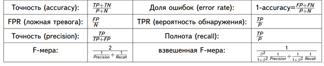
Рассмотрим матрицу ошибок на практическом примере для задачи прогнозирования спроса на скоропортящуюся продукцию, которая должна быть продана конечному пользователю в течение суток. Например, букеты цветов, продающиеся по цене k рублей при закупочной стоимости в p рублей. Предположим, с помощью Machine Learning было предложена 2 варианта:
- Положительный прогноз (+), что по цене k будут полностью раскуплены все цветы в количестве n букетов.
- Отрицательный прогноз (+), что по цене k будут полностью раскуплены не все цветы, останется m не проданных букетов.
Соответственно, матрица ошибок для этого случая будет выглядеть следующим образом:
|
Прогноз |
Реальность |
|
|
Проданы все букеты цветов |
Остались не проданные m букетов |
|
|
+: Проданы все n букетов по k рублей c ценой закупки p |
True Positive: прогноз совпал с реальностью, все закупленные n букетов проданы Выручка = n*k Затраты = n*p Прибыль = n*(k-p) Стоимость ошибки = 0 |
False Positive: ошибка 1-го рода, ML-модель предсказала, что будет n продаж, а на самом деле их было (n-m), осталось m не проданных букетов, которые пропали и не вернули затраты на их покупку Выручка = (n-m)*k Затраты = n*p Прибыль = n*(k-p) – m*k Стоимость ошибки = m*p |
|
—: Остались не проданные m букетов c ценой закупки p |
False Negative: ошибка 2-го рода – ML-модель предсказала, что n букетов не будет продано, поэтому закупили (n-m) букетов, но спрос был на n букетов. Эффект недополученной прибыли Выручка = (n-m)*k Затраты = (n-m)*p Прибыль = (n-m)*(k-p) Стоимость ошибки = m*k |
True Negative: ML-прогноз совпал с реальностью, было раскуплено (n-m) букетов по цене k, сколько и было изначально закуплено по цене p Выручка = (n-m)*k Затраты = (n-m)*p Прибыль = (n-m)*(k-p) Стоимость ошибки = 0 |
Аналитика больших данных для руководителей
Код курса
BDAM
Ближайшая дата курса
28 июня, 2023
Длительность обучения
24 ак.часов
Стоимость обучения
66 000 руб.
Таким образом, с помощью confusion matrix можно измерить эффективность прогноза в денежном выражении, что весьма актуально для практического бизнес-приложения Machine Learning. Впрочем, отметим еще раз, что данный метод предварительной оценки будущих сценариев можно использовать и вне сферы Data Science, оценивая риски и перспективы в рамках классического бизнес-анализа.

Другие практические вопросы системного и бизнес-анализа рассматриваются в рамках нашей Школы прикладного бизнес-анализа. А особенности практического применения больших данных и машинного обучения разбираются на наших образовательных курсах в лицензированном учебном центре обучения и повышения квалификации ИТ-специалистов (менеджеров, архитекторов, инженеров, администраторов, Data Scientist’ов и аналитиков Big Data) в Москве:
- Аналитика больших данных для руководителей
- Машинное обучение на Python
Источники
- https://www.the-village.ru/village/city/news-city/371179-tseny
- https://www.the-village.ru/village/business/businessmen/371631-kuhnya-na-rayone
- https://chernobrovov.ru/articles/kak-mashinnoe-obuchenie-pomogaet-pravilno-ustanavlivat-pravilnye-ceny.html
- https://habr.com/ru/company/ozontech/blog/431950/
- http://futurebanking.ru/post/3213
- https://hranalytic.ru/kak-ponyat-matrica-nesootvetstvij-confusion-matrix/
- https://chernobrovov.ru/articles/kak-izmerit-effektivnost-machine-learning-schitaem-metriki-i-dengi-na-primere-prognozirovaniya-ottoka-polzovatelej.html
- http://www.machinelearning.ru/wiki/images/archive/5/54/20151001162720!Kitov-ML-05-Model_evaluation.pdf